Here's something you might be interested in.
Ask a Hipster — Advice you didn't know you needed
Big Screen — Movie commentary
Blurt — Music's inside track
Booze News — San Diego spirits
Classical Music — Immortal beauty
Classifieds — Free and easy
Cover Stories — Front-page features
Drinks All Around — Bartenders' drink recipes
Excerpts — Literary and spiritual excerpts
Feast! — Food & drink reviews
Feature Stories — Local news & stories
Fishing Report — What’s getting hooked from ship and shore
From the Archives — Spotlight on the past
Golden Dreams — Talk of the town
The Gonzo Report — Making the musical scene, or at least reporting from it
Letters — Our inbox
Movies@Home — Local movie buffs share favorites
Movie Reviews — Our critics' picks and pans
Musician Interviews — Up close with local artists
Neighborhood News from Stringers — Hyperlocal news
News Ticker — News & politics
Obermeyer — San Diego politics illustrated
Outdoors — Weekly changes in flora and fauna
Overheard in San Diego — Eavesdropping illustrated
Poetry — The old and the new
Reader Travel — Travel section built by travelers
Reading — The hunt for intellectuals
Roam-O-Rama — SoCal's best hiking/biking trails
San Diego Beer — Inside San Diego suds
SD on the QT — Almost factual news
Sheep and Goats — Places of worship
Special Issues — The best of
Street Style — San Diego streets have style
Surf Diego — Real stories from those braving the waves
Theater — On stage in San Diego this week
Tin Fork — Silver spoon alternative
Under the Radar — Matt Potter's undercover work
Unforgettable — Long-ago San Diego
Unreal Estate — San Diego's priciest pads
Your Week — Daily event picks
Movie poster rejects you've never seen, longlost original artwork
Huge film history stash discovered and photographed
Unused concept artwork for Voyage of the Rock Aliens
Here's a rare collection of scans from a collection of original artwork and proof prints that I once archived for local memorabilia dealer Duane Dimock. The collection includes over a hundred HUGE paintings and proofs, by a variety of well-known Hollywood poster artists, done in advance for the filmmakers behind Batman, the Fly, Witches of Eastwick, and a bunch of other biggies (as well as some not-so-biggies nonetheless of interest). Most of these are the REJECTED versions, although several sets include the actual final artwork, as photographed for the official posters.
In many cases, several similar designs are seen that show the ideas being worked out, in a creative progression leading up to the iconic images finally approved by the filmmakers and printed up to promote the film.
Few of these original paintings and poster proofs have ever been published or seen by the general public. You lucky Reader readers are the first to get an eyeful of this almost completely unchronicled bit of motion picture history -------
Browsing below, you can see the iconic poster artwork for The Fly originally had the image of a human climbing out of the device. However, what looked like a hastily spray-painted white paste-on was applied directly over the artwork, so only the white glow was evident in the final printed shot.

Ken Steacy's rejected poster for Supergirl coulda and SHOULDA found a way into theater marquees, as it's monumentally superior to virtually all the sappy over-airbrushed "official" posters that failed to lure any asses into the seats.
Most of the photos were shot with an old 110 Instamatic camera, over the course of the few hours I handled the originals: it just seemed like a good idea to archive what all was there. Most of this collection remains intact, though Dimock has sold off a handful of pieces.
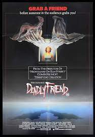
The collection includes Destiny, Ladyhawke, 8 Million Ways to Die, Deadly Friend, Purple Hearts, City Limits, Hollywood Shuffle, the Inheritors, the Fly, Fright Night, Best Defense, Meatballs III, Vamp (quite a few variations), Inside Moves, XYZ Murders, Over the Top (yep, the Stallone movie, with a surprising amount of variations), Texas Godfather, Blood Diner, Howard the Duck, Cowboy Angel (a splendid oil painting of an angelic Slim Pickens riding a horse down from heaven?!), Trick or Treat (rock ‘n’ roll horror), Back to the Beach, Voyage of the Rock Aliens, Fatal Attraction, Little Shop of Horrors, Hanoi Hilton, Cop, Force III, Off Limits, Mac and Me, Mr. Love, Lady Beware, Phar Lap, Midnight Run, Bad Medicine, Hamburger Hill, Near Dark, Starchaser: The Legend of Orin, and others.

The original Howard the Duck comic books used to carry a cover tagline reading "Trapped in a world he never made." Whoever painted above rejected poster seems to have taken that quite literally, with Howard actually IN the world, coming out as if from an egg. Here's another ditched duck concept:
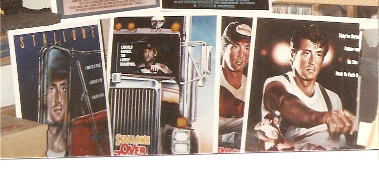
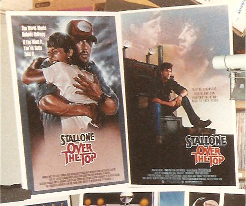
I cracked up when I noticed the Over the Top reject above where Stallone seems to have his side view mirror adjusted so he can stare at himself instead of the road - note that's the only variant with his NAME running all the way over the TOP of the poster, independent of the film title. Here's few more rejected OTP posters.

I LOVE above unused Ladyhawk painting!
The iconic poster artwork below for The Fly originally had more of the image of a human climbing out of the device, including the outline of his head and shoulders. Here's the version nobody has ever seen before!
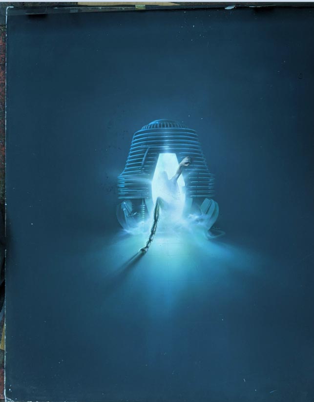

However, as you can see in above variant version, what looked like a hastily spray-painted white paste-on was applied directly over the artwork, so only the white glow was evident in the final printed shot, with just the human arm and insect leg coming out either side. BIG improvement, with a much more mysterious impact.
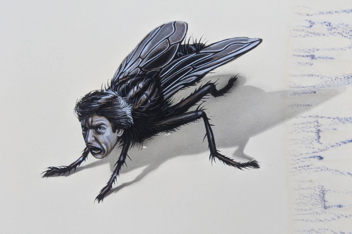
Me, I kinda like the above rejected version showing just a fly: THE Fly, with Jeff Goldblum's head! Although, now that I examine more closely, that looks like Donald Trump! "Screeeen meeeeeee!"
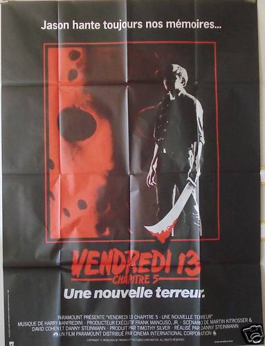
While researching this artwork, I discovered that a lot of pieces that at first seemed to be "rejected," IE not the final poster we're used to seeing in the U.S., did finally end up being recycled into service for later media (video, DVD) and for overseas releases. Above artwork ended up being used for an import poster for Friday the 13th Part 5 (below).
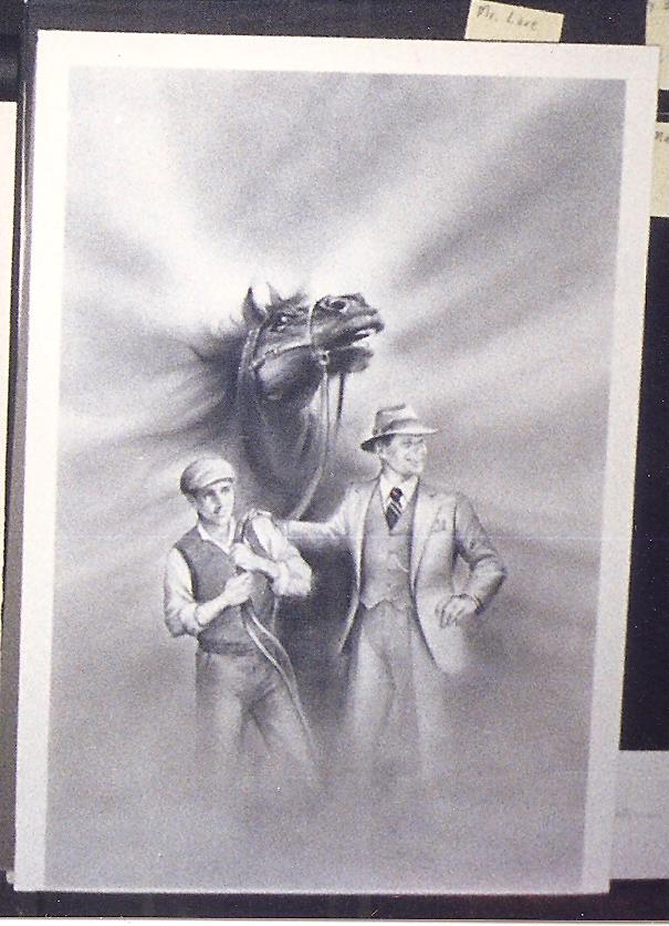
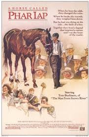
I kind of like the wistful nostalgia in this proposed painting for Phar Lap (above), but they went in a different direction with the final poster (below).
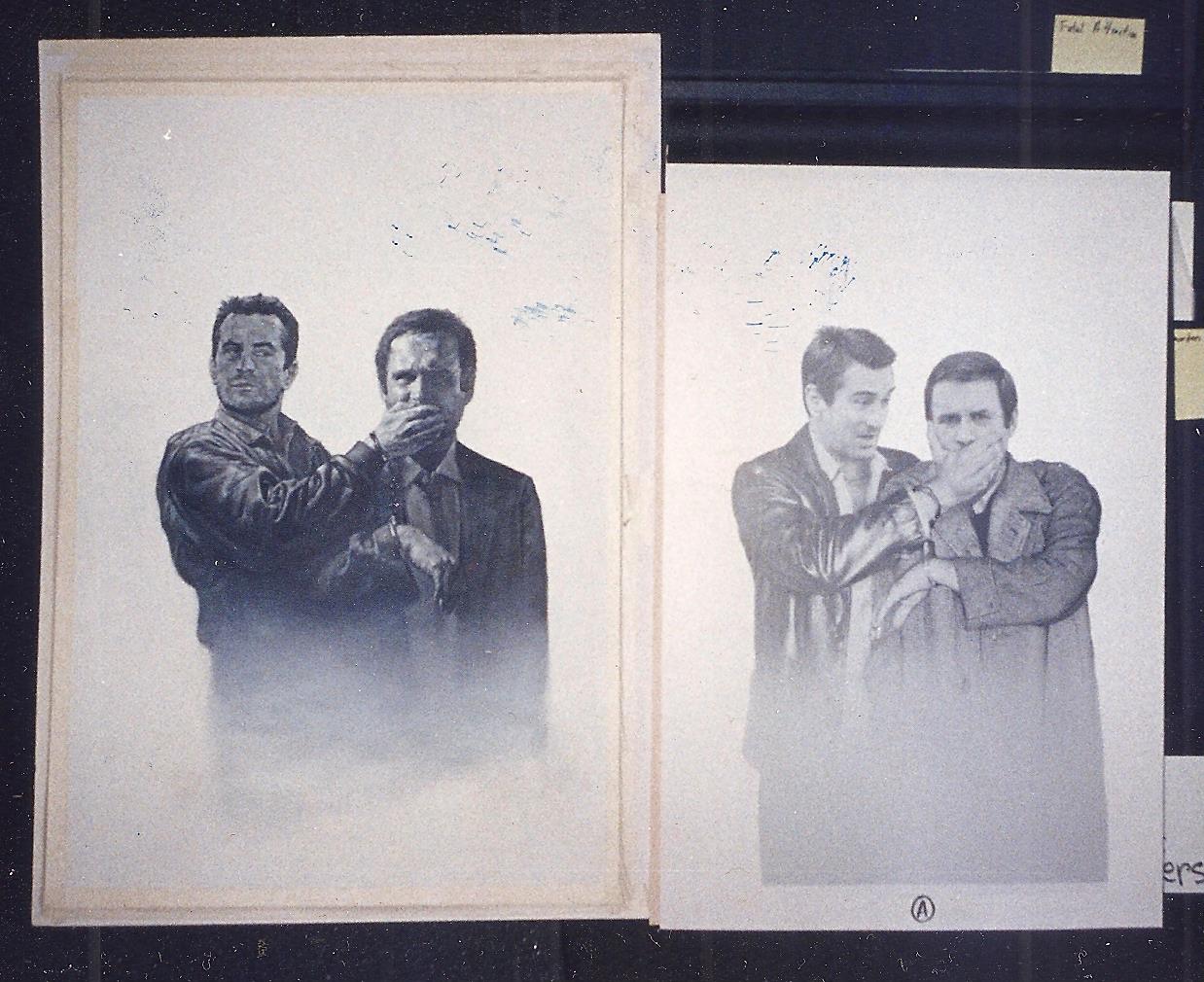
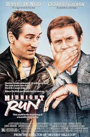
Marked on the back as "Running Scared," above mockups of course ended up being for Midnight Run. Final print below shows they went with DeNiro glaring more directly at Grodin, whose handcuffed wrist was switched to the other side (a subtle, but strong, improvement).
A variation of above two mockups for Starchaser: The Legend of Orin finally ended up on the DVD packaging (below), though the theatrical poster was pretty different.

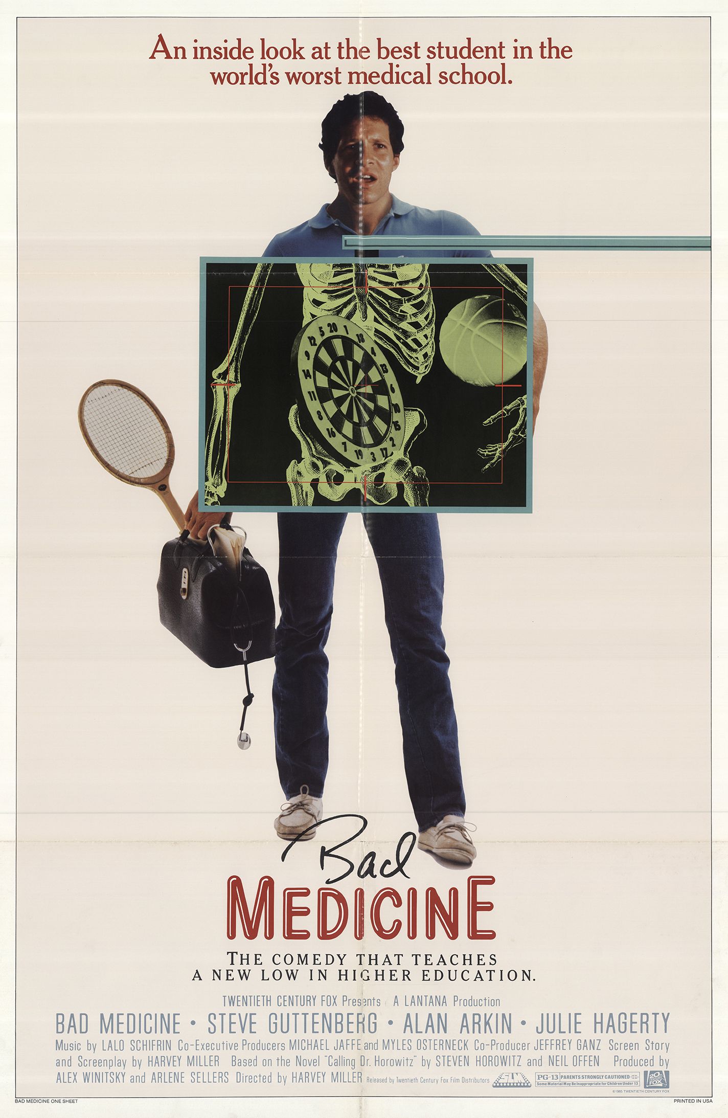
Above Bad Medicine designs appear to have been abandoned altogether for the final published poster (below).
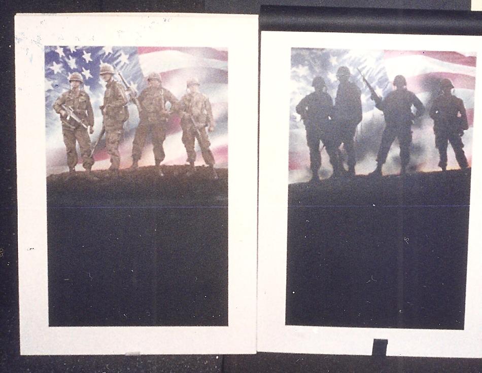
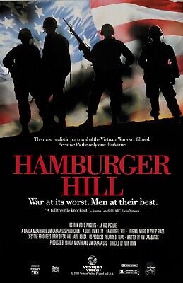
The original photo print for Hamburger Hill (above) had the soldiers more more clearly lit and visible - going with the darkened outline in the final released version (below) seems a good, and somewhat somber, way to go!

Unused painting for A Time of Destiny with William Hurt (above).

Interesting to see that the original rejected Campus Man poster art (above) spotlighted the comic lead (John Dye), while the final released print (below) went with the hunky alter-ego image.

Nightmare on Elm Street honcho Wes Craven went through several poster ideas to promote Deadly Friend (above)...
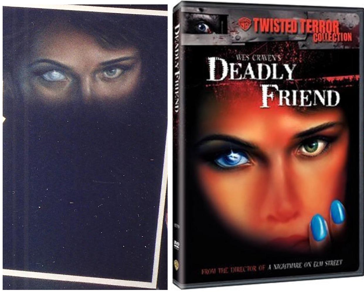
...finally setting on above painting, with the center painting of the girl added to the window painting for the final printed poster seen below.
The eyeball variation also turned up later on a DVD package (below), but with the artwork heavily airbrushed, to hide the fact that the added nose and fingernails are clearly by a different (and much crappier) "artist."
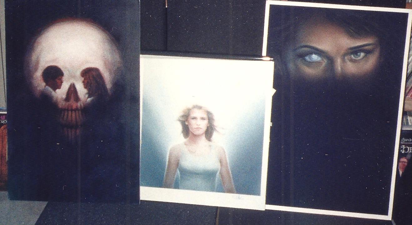
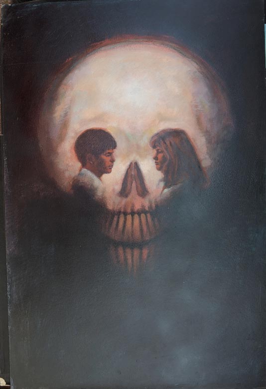
From a design standpoint, I prefer the completely unused Deadly Friend skull variant below, with its eyes subtly depicting the romantic couple facing each other!
As terrible as the rockin' horror movie Trick or Treat is, the poster COULD have been okay, had they gone with rejected oil painting (above) instead of the crappy final poster (below).
An altered version of the rejected painting did eventually turn up as a CD cover (below) from soundtrack band Fastway.

Blood Diner art above, final released poster below.

The Texas Godfather art above, final poster below.
Above proof for the Elliott Gould/Margot Kidder potboiler Vanishing Act is pretty close to what was used (below).

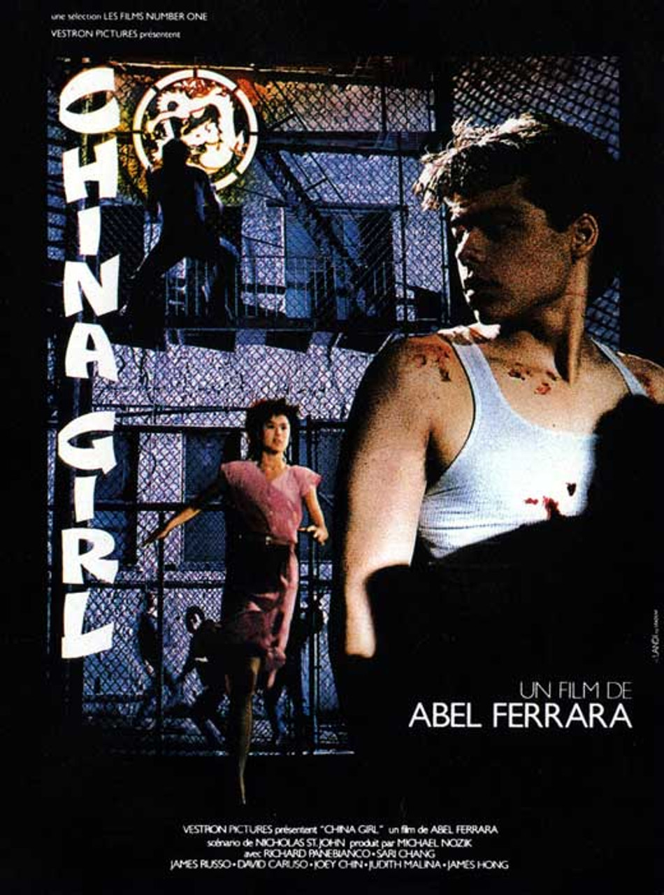
Whereas the ominous China Girl artwork (above) was completely ditched for the (quite lame) poster below.

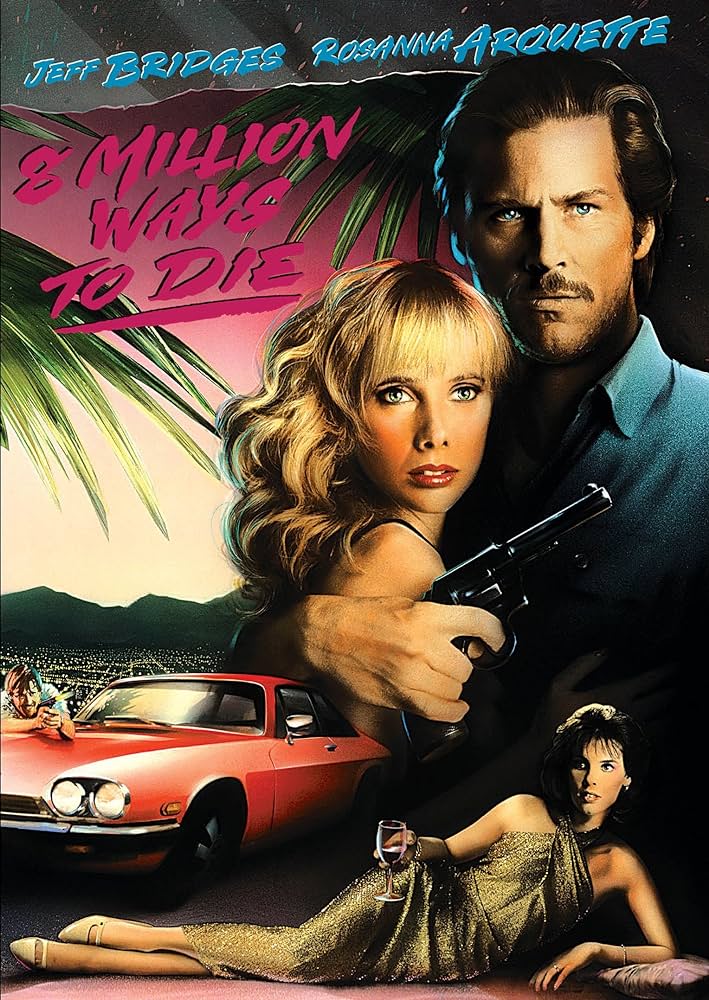
8 Million Ways to Die, before (above) and after (below).
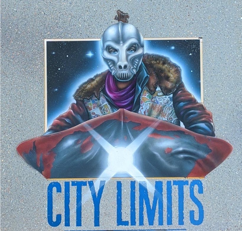
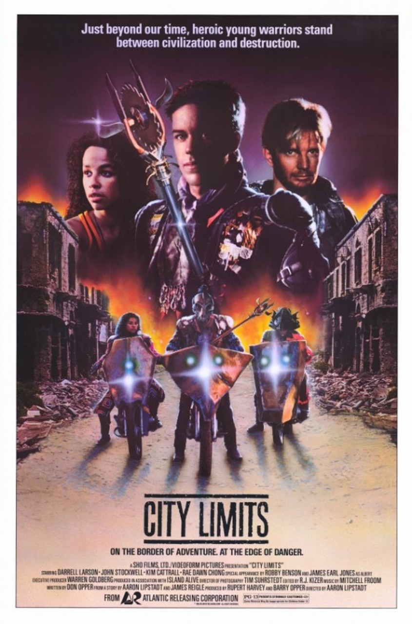
The City Limits rejected original art (above) seems to my eye far superior to the final versions used for a European DVD and the U.S. movie poster (below).


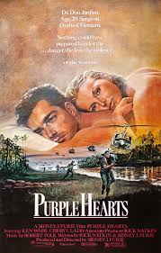
And interesting how they ditched the soldier's photo-decorated military helmet (above) altogether for Purple Hearts, to instead blow up the romantic photo, hovering over a battlefield (below). Another major misfire, IMHO.
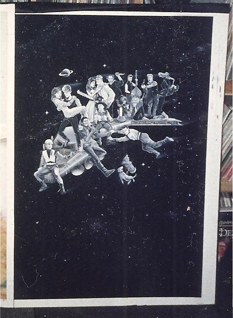
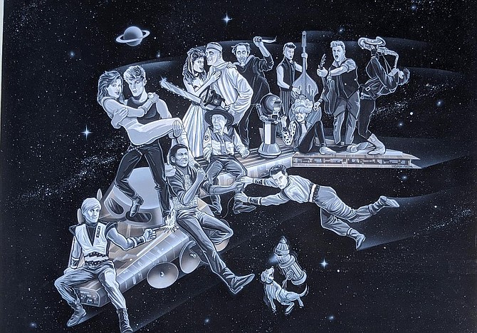
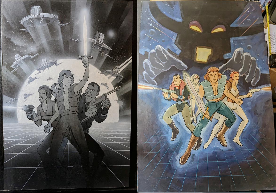
The Pia Zadora cult classic Voyage of the Rock Aliens was a cynical attempt to create a "cult" film (co-starring Harold & Maude icon Ruth Gordon), but the above rejected poster couldn't make up its mind WHAT to showcase.

I can't say final posters (below) are any improvement. The trippy guitar-shaped spaceship all but obscured in the reject gets a sweet makeover (with tuning pegs instead of satellite dishes on the headstock), and there's still a (space?)hydrant leaking onto a (space?)dog, but most of the other proposed elements were ditched.


The concept art for the (pretty cool) Annette Funicello/Frankie Avalon/Pee Wee Herman vehicle Back to the Beach (above) is SO bizarre, words fail me. In this case, the final poster (below) is a VAST improvement! The only holdover from the nearly deranged mockup was a simplified version of the title logo.
I'm really impressed by the design qualities of above concept art for the Michael Douglas/Glenn Close thriller Fatal Attraction, even though it looks like Douglas' stunt double posed for the pic rather than him. The now-iconic final poster (below) works well now that we all know the storyline, but I can't help but feel the reject would have been a much stronger pre-release promo. Ahh, whaddo-eye-no, the ghastly thing was a monster hit anyway (in support of my many rabbit friends, I'm still boycotting that one - my duck friends won't let me watch Journey to the Center of the Earth either).
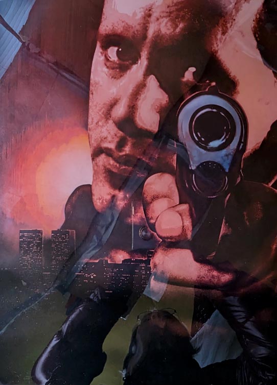
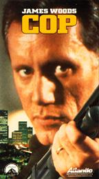
The James Woods Cop mockup (above) was pretty similar to what ended up being used (below).
Here's the original artwork for the Chuck Norris film Lone Wolf McQuade (above) along with the mostly unchanged final poster (below).

Rejected Off Limits concept art below on left and final poster on right.
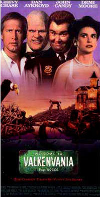

Welcome to Valkenvania (above left) was later retitled Nothing But Trouble, with a few shifts done to a couple of characters in the final artwork as well.

Deadly Blessing reject (above) VS final poster below. Only major changes are the rejected tagline "Beauty Comes to an Evil Climax" (coupled with the pic, maybe it looked like the movie was about an evil beauty, um, climaxing?) and some kind of satanic-looking logo that got cut. Also, note how the overlay text is lowered several inches on the final poster, the better to reveal MUCH more glowing blue cleavage...

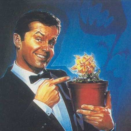
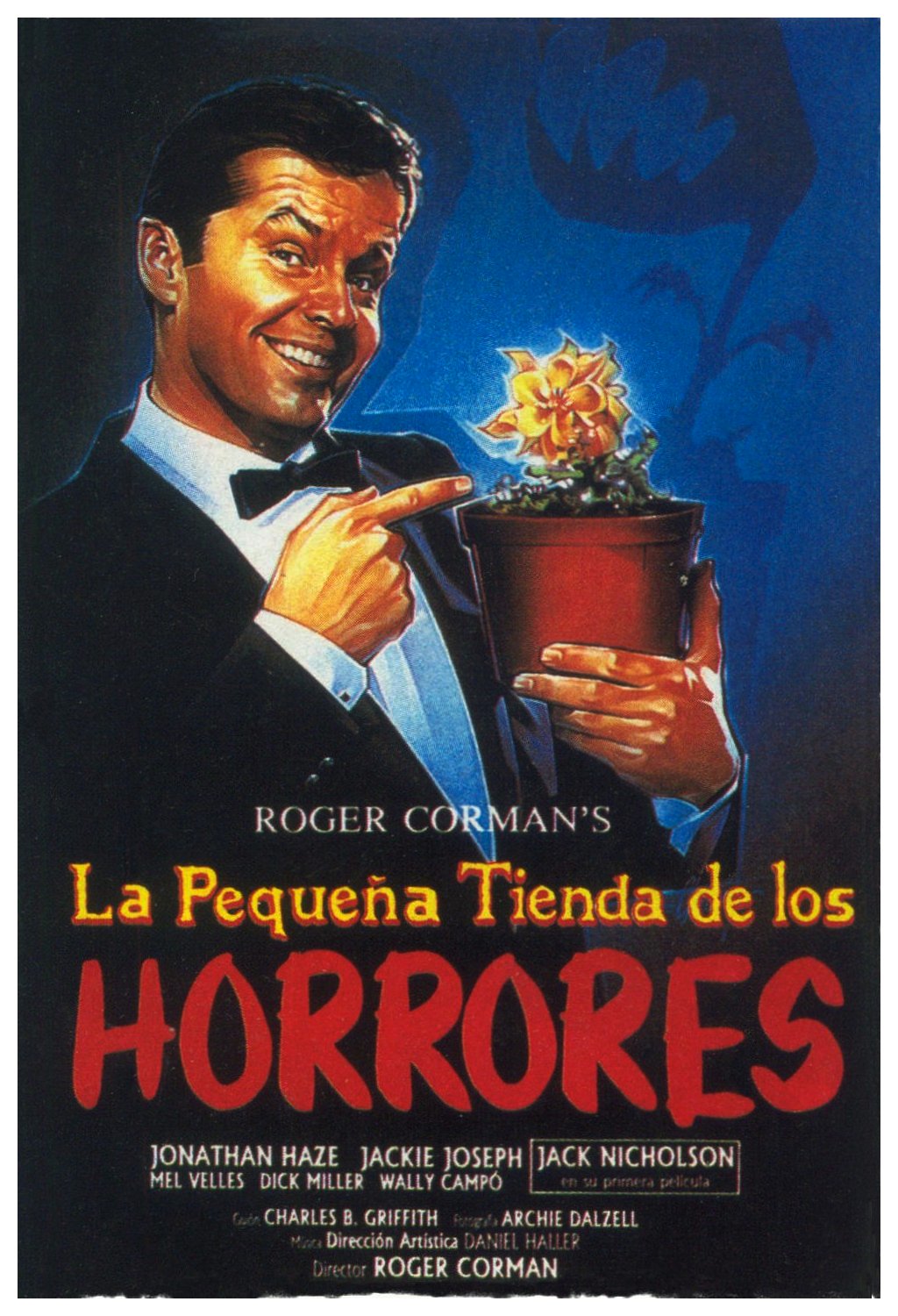
Despite Jack Nicholson only making a brief appearance in the original Roger Corman horror comedy Little Shop of Horrors, it was Jack they focused on for the re-release poster (above). The design appears to have turned up in poster variants, including a Spanish version (below).

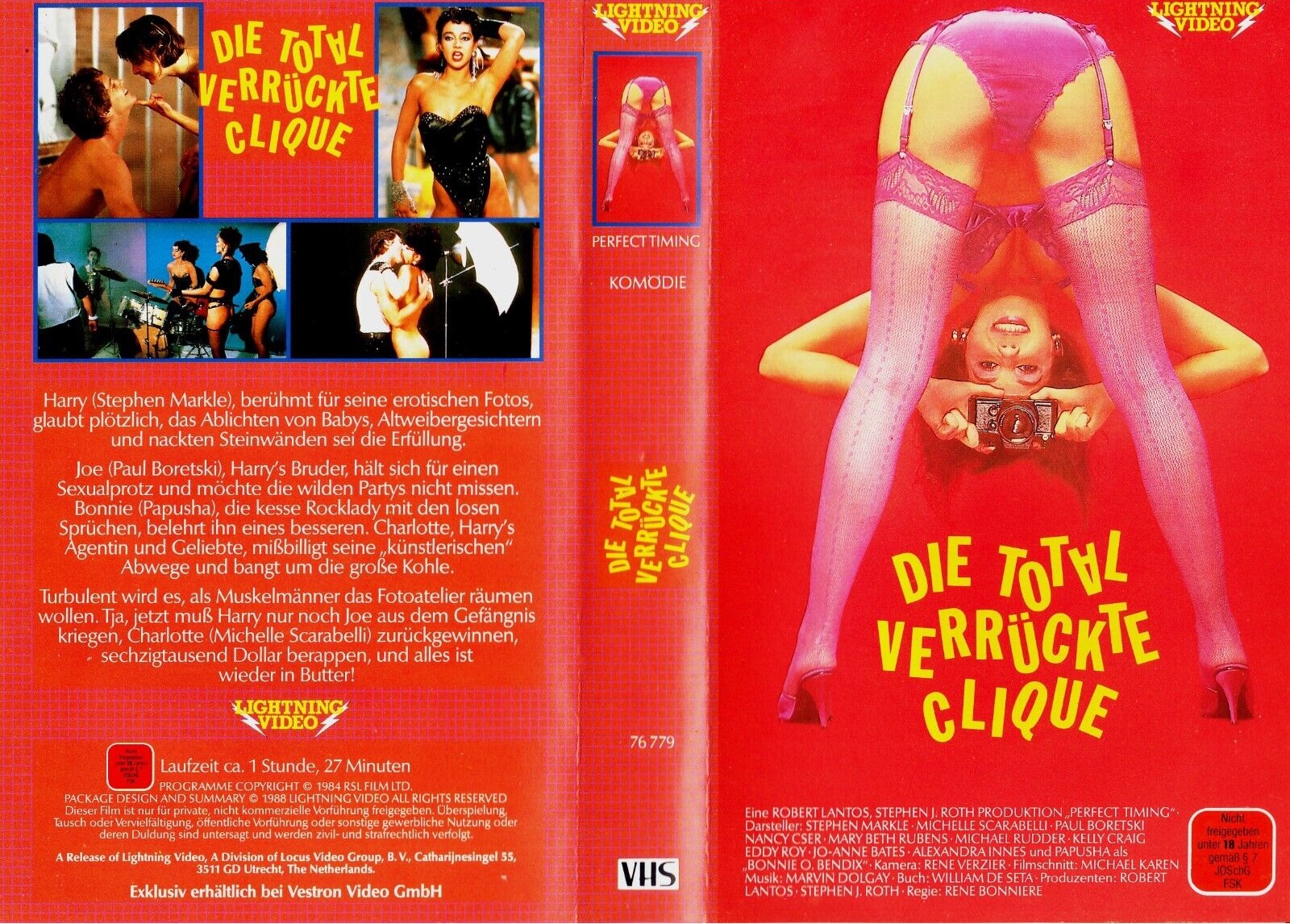
It took me awhile to find a utilized version of the poster artwork for the obscure sex comedy Perfect Timing that used above artwork, but here 'tis below.
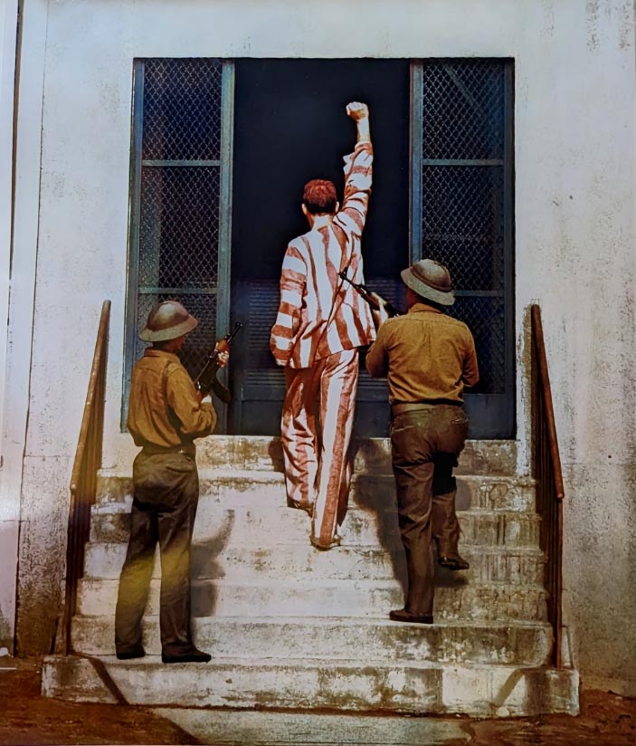
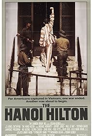
Above poster design for Hanoi Hilton is pretty much what was used, though note final version (below) was revised to feature an additional fence railing, some chain link fencing on either side of the doorway, and an extra Vietnamese soldier was added, I guess to reinforce the "captivity" theme.
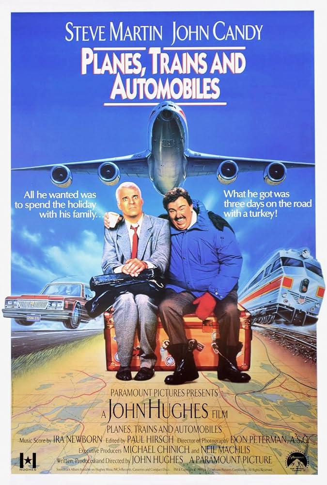
Above concept proof for Steve Martin and John Candy in Planes Trains & Automobiles seemed to favor the titular plane, a motif that turned up in altered form on the French movie poster (along with a train and an auto, tho they were flying too). The whole vehicle schtick was jettisoned entirely for the U.S. version now so recognizable, as well as foreign posters (below), wherein Candy wore basically the same dumpy outfit seen on the proof, while Martin went from trenchcoat to rumpled suit (duh!), and they BOTH lost the stupid hats (who the Hell puts a hat on Martin's million dollar mane?!).


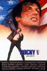
Rocky: The Final Bell (above) was the original title for Rocky V, for which the final utilized poster (below) wisely didn't rely on a near-comatose closeup of Stallone.
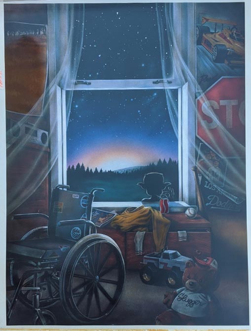
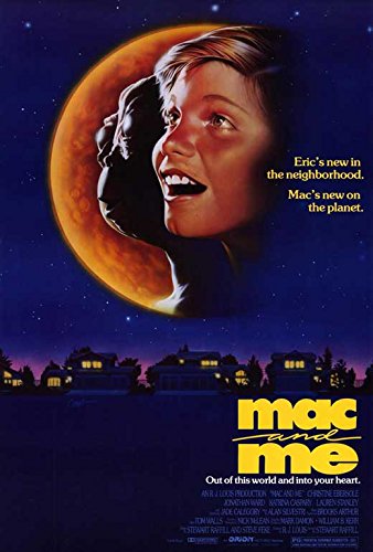
Full-length McDonald's commercial Mac & Me actually had an intriguing poster (below) that seemed to deliberately rip off ET, but the rejected mockup (above) is a bit of a head scratcher. At least the wheelchair in the rejected version (above) was a somewhat more honest representation of the actual flick.
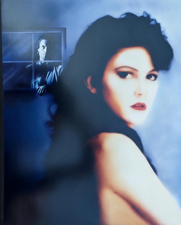
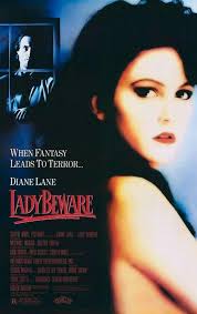
Above shows the entire photo of Diane Lane from Lady Beware, used for final print below.

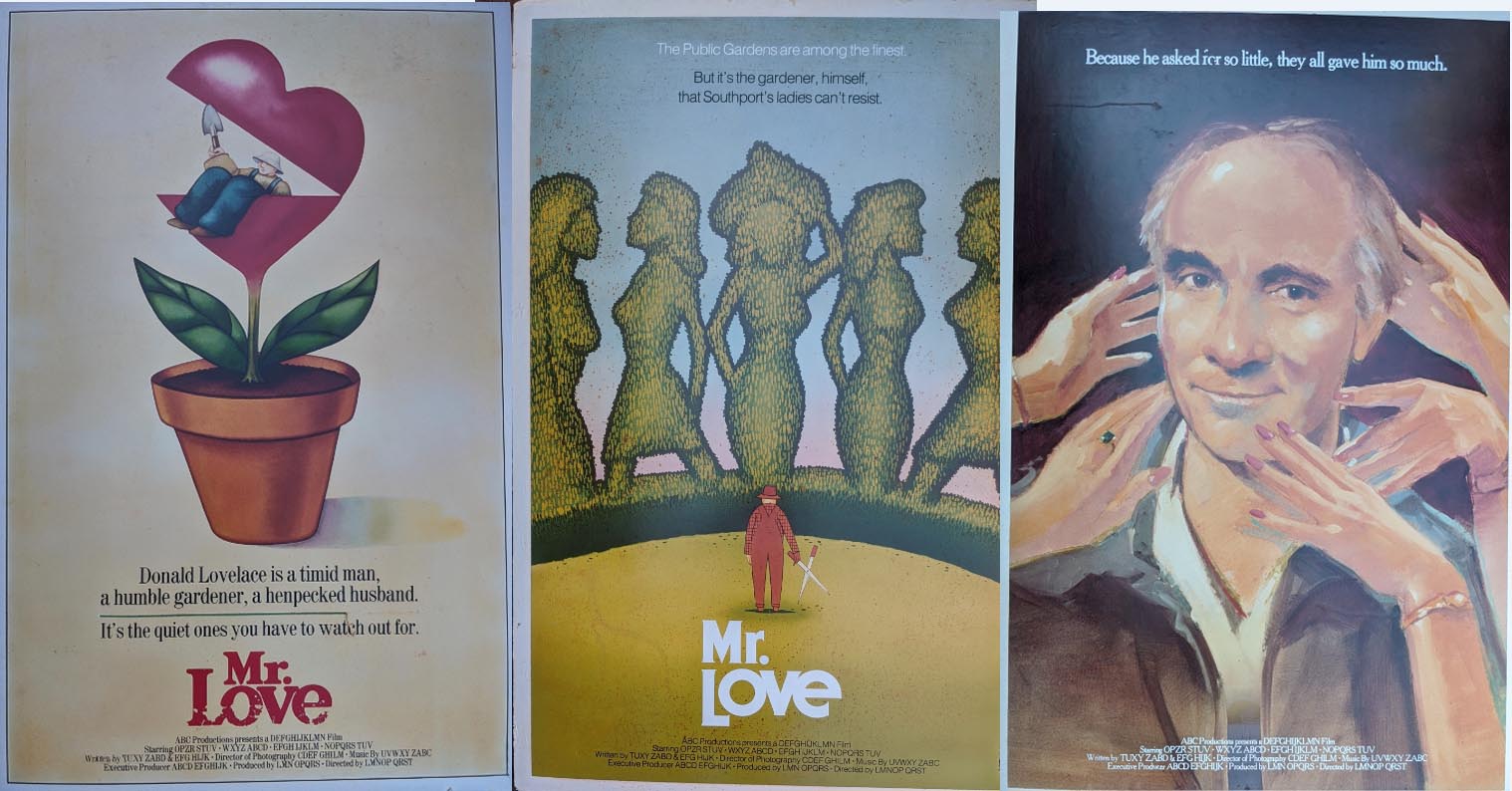
I'm so glad to see the terrific painting above did indeed make it onto the poster for the UK comedy Mr. Love, flanked below by two rejected drafts.

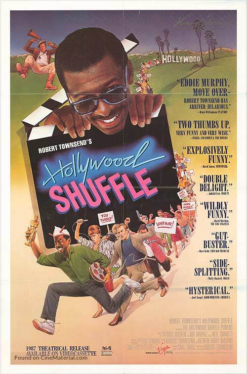
Hollywood Shuffle collage mockup above and final poster below.
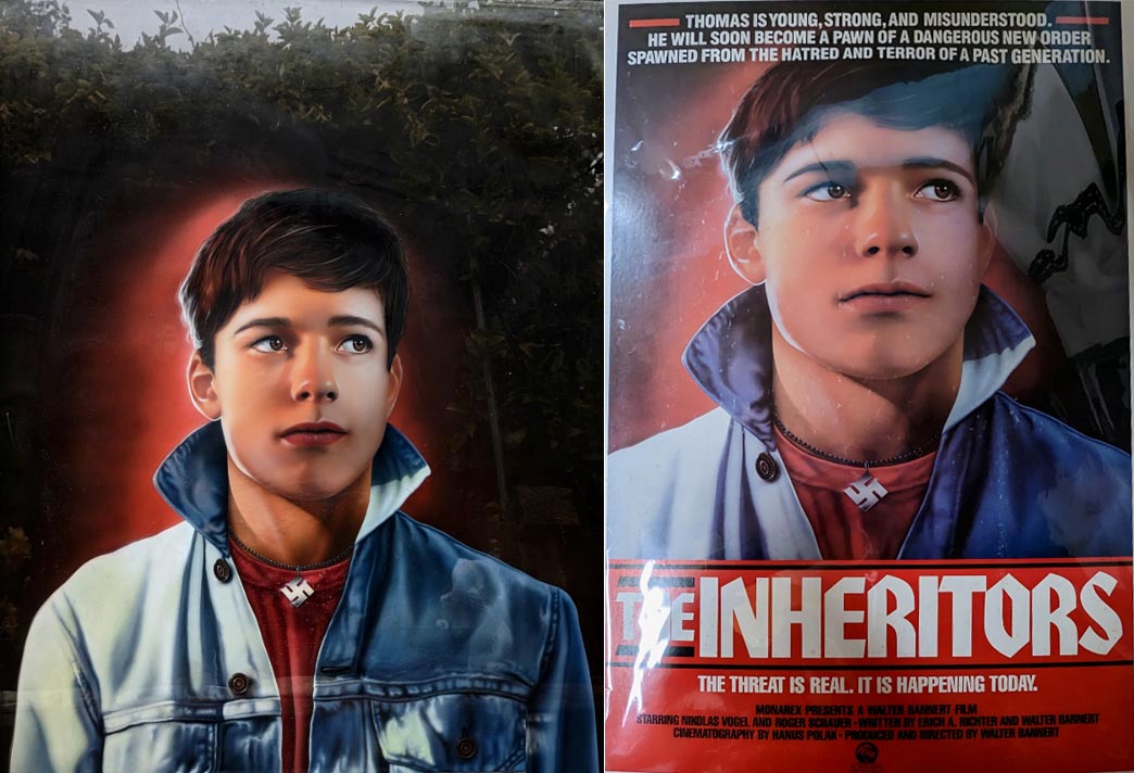
Above: Original painted artwork for the Walter Bannert’s German-language Austrian film the Inheritors alongside final print.
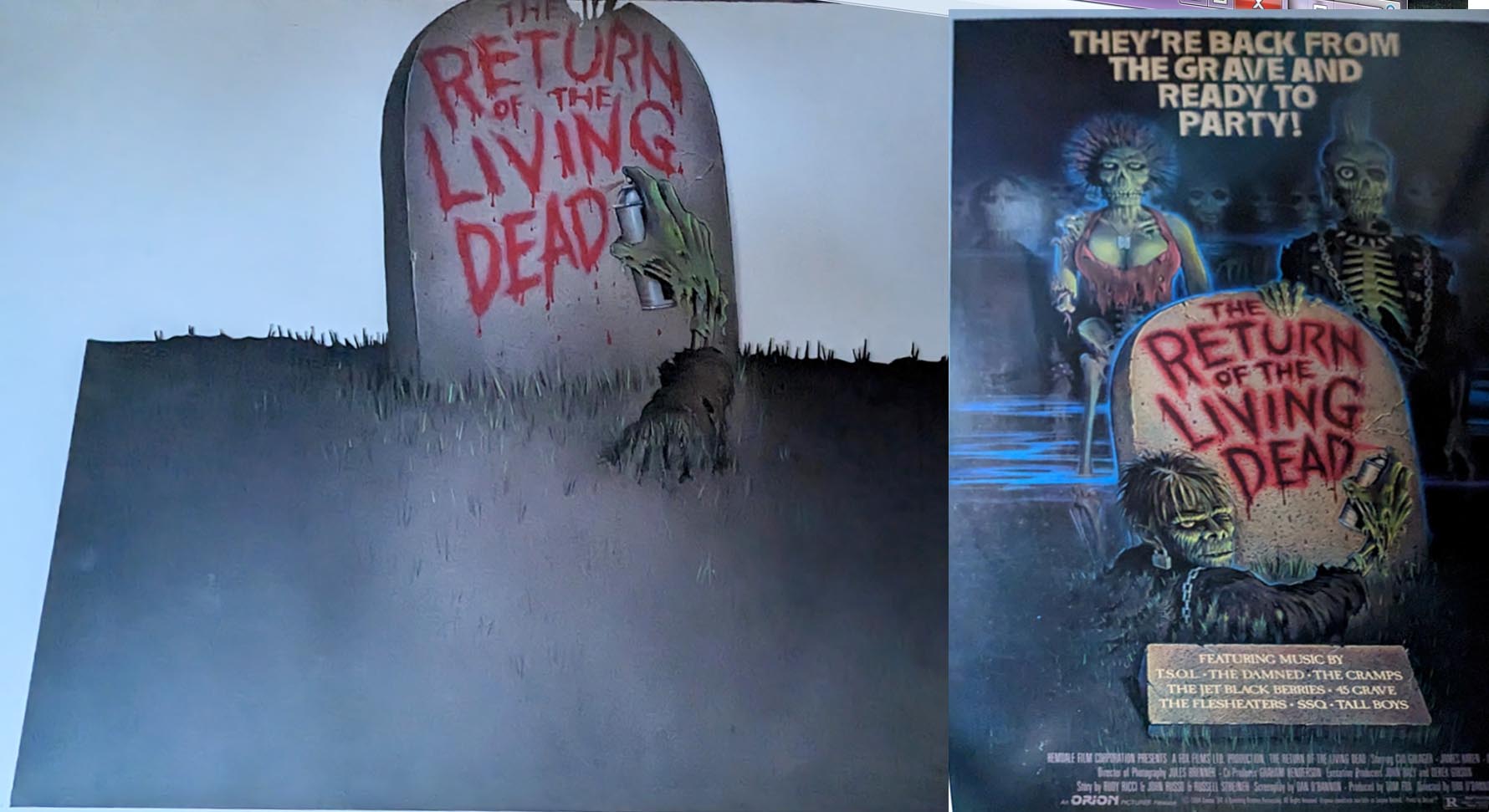
Check out the original painted art for the Return of the Living Dead tombstone (above), before the comical zombies were added to the final poster. Note the spraycan-bearing skeleton hand was originally the only part of the zombie arising from the grave.
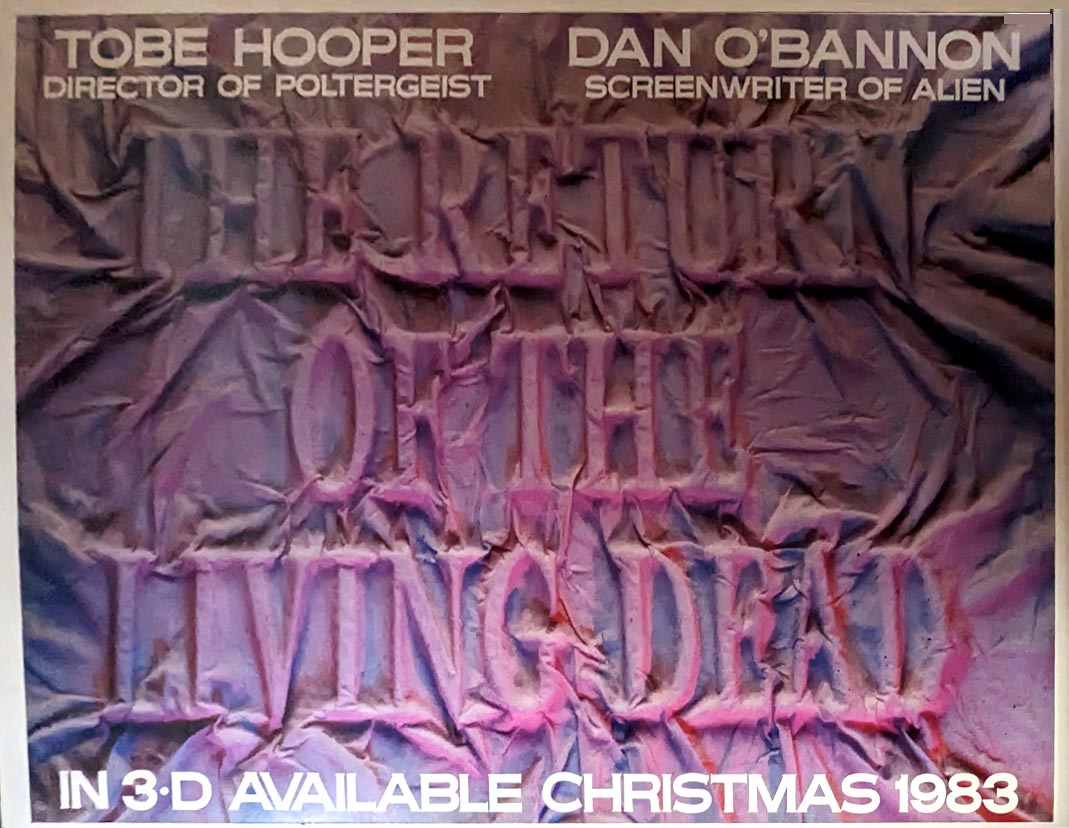
And this was a real surprise. Note above horizontal variant is dated a full two years before Return of the Living Dead was actually released. And it was originally planned for 3D?! As far as I know, this is a hitherto unknown component in the film's early development ---
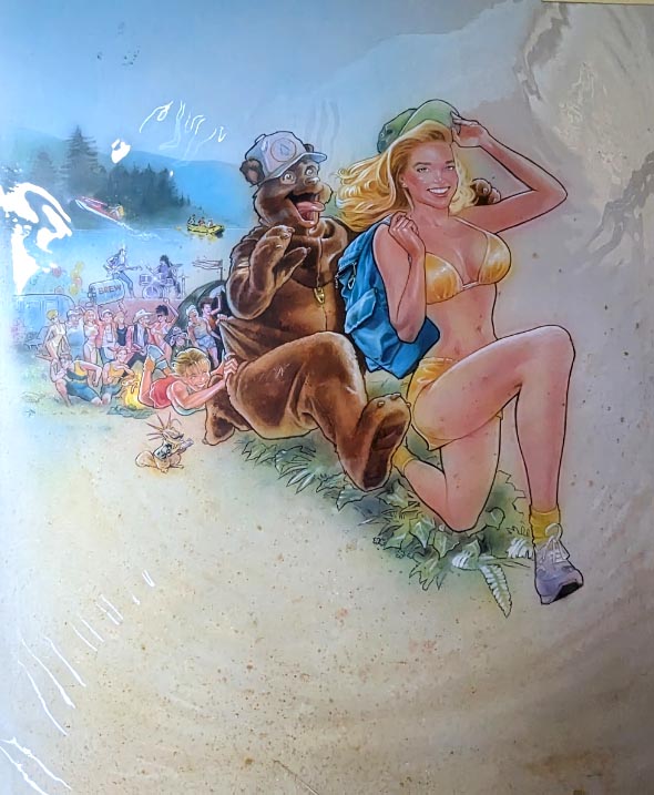
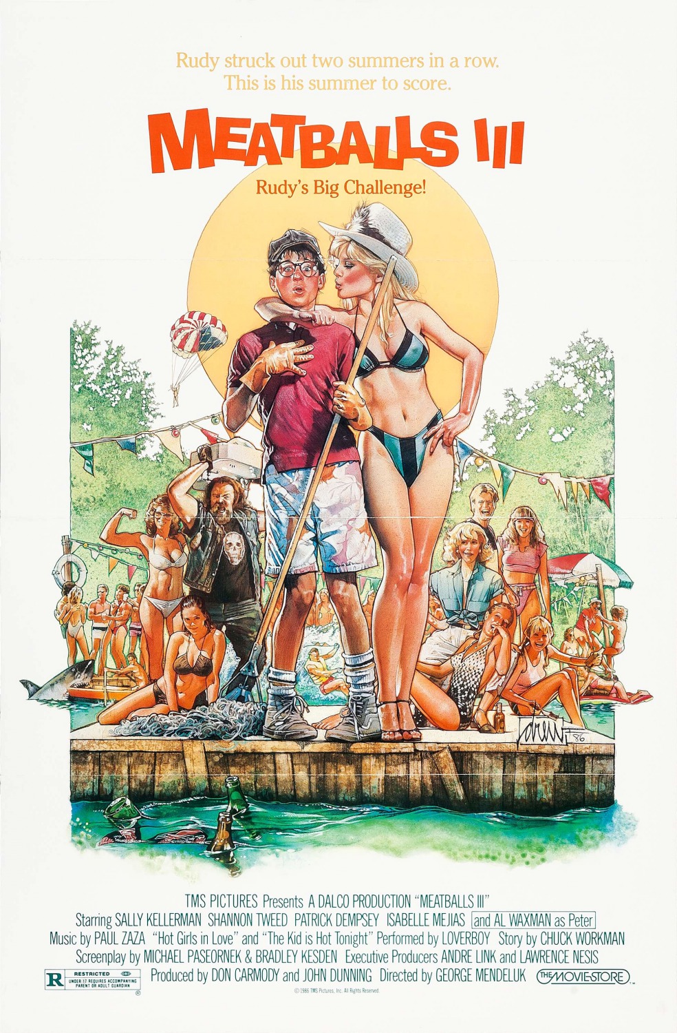
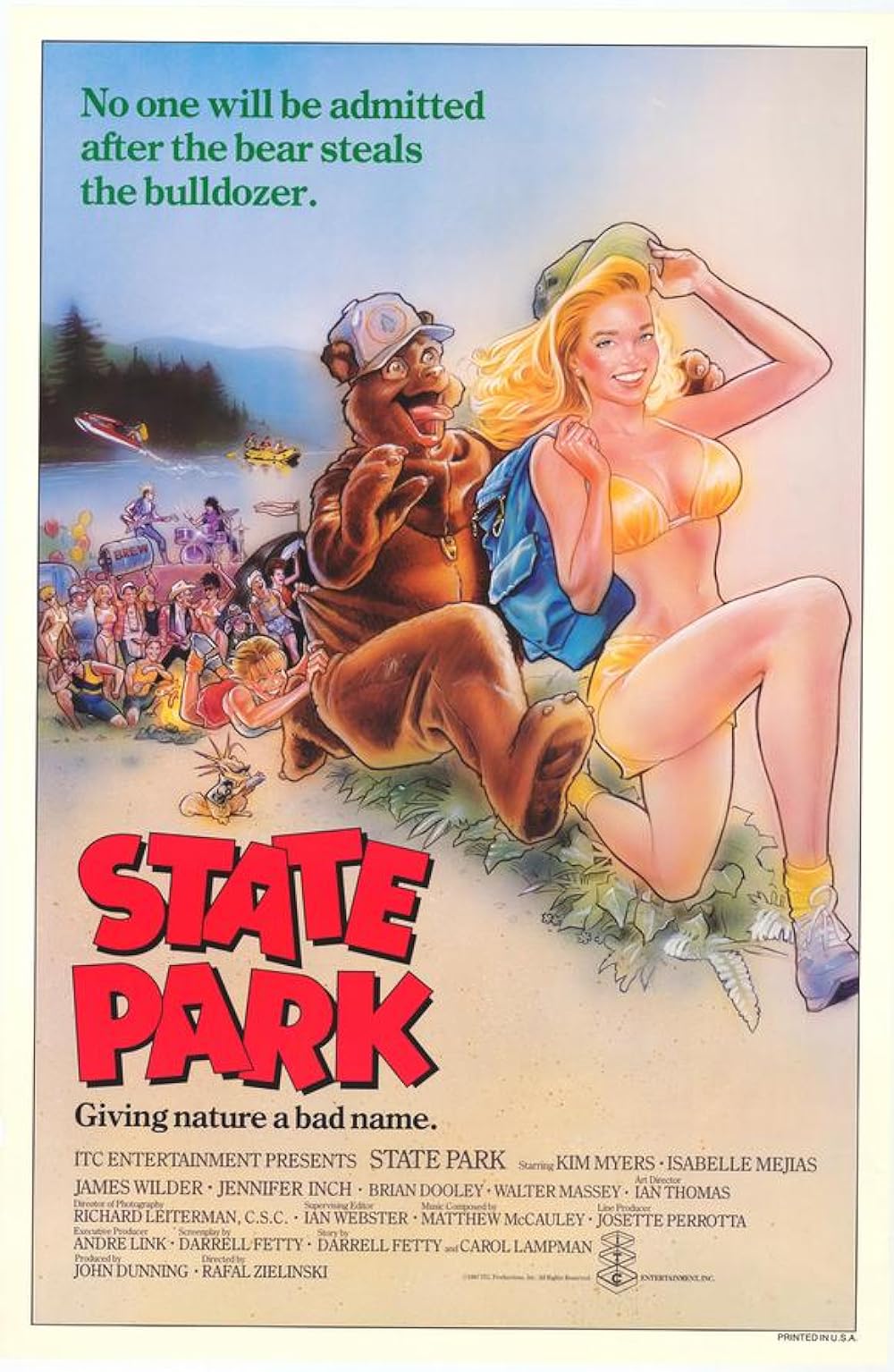
I LOVE the unused painting for the camp(y) comedy Meatballs III (above) with a dude in a bear suit chasing bikini-clad Shannon Tweed (Mrs. Gene Simmons must've always had a thing for guys in costumes). Apparently, the subtitle "Rudy's Big Challenge" hadn't been christened yet, as Rudy is nowhere to be seen. I also totally dig the iconic final version (below) of this guilty pleasure co-starring Sally Kellerman (and featuring Loverboy's "The Kid is Hot Tonight"! Premium cheez or what?!). What's weird, though, is that the above reject DID eventually turn up, but on a poster for an entirely separate movie called State Park.
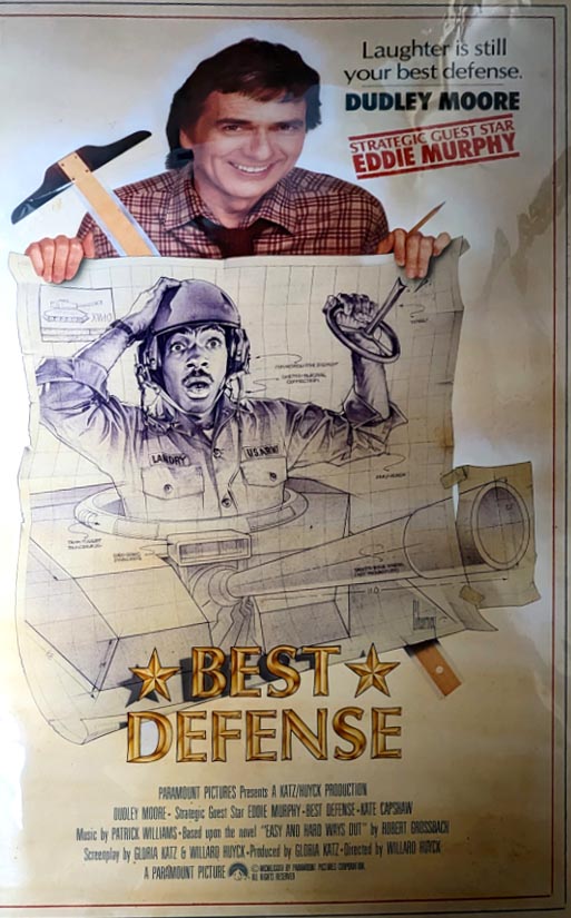
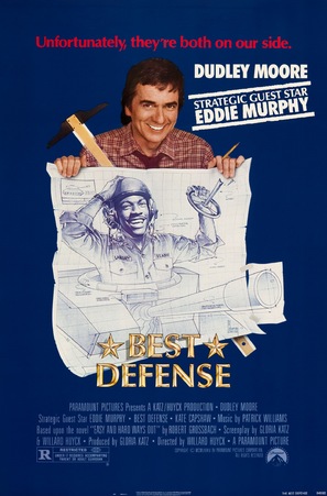
Best Defense rejected draft (above) and the final released poster (below). Now this one is flippin' bizarre - look how the tank blueprint originally had Eddie Murphy drawn in, as if part of the rendering, looking dumbfounded by the broken steering wheel. But the crazy effin final print (below) pasted in a B&W photo of Murphy's face, inexplicably grinning like a happy idiot, despite his clearly defective ride! And the rejected tagline seems much better too. They went with "Unfortunately, they're both on our side," but I prefer "Laughter is still your best defense." Too bad nobody who saw this movie was laughing.
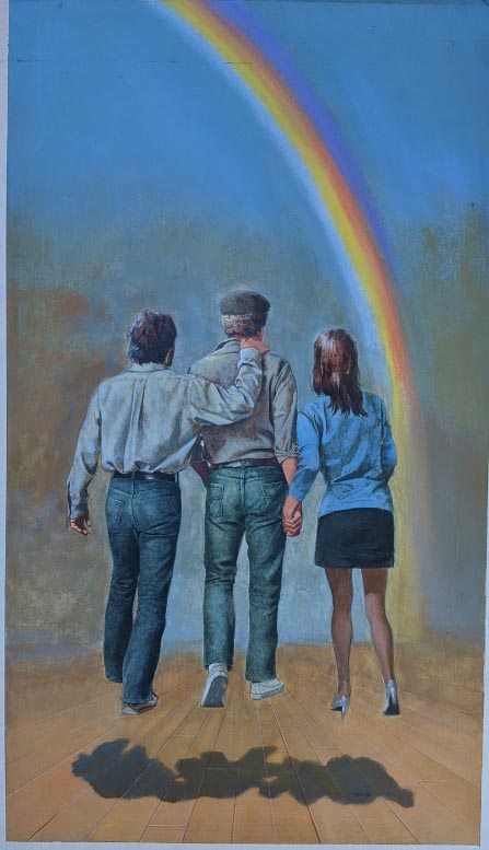
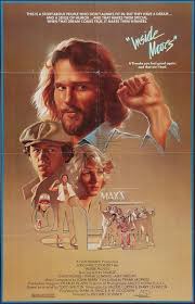
Inside Moves reject (above), which is a fabulous painting evocative of Norman Rockwell, versus the dull and drab final version (below).
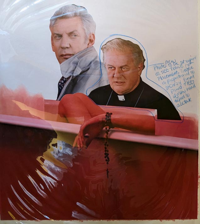
Rosary Murders photo pasteup above, while the whole corpse-in-a-tub motif was still in the planning stage. Poor ol' Charles Durning - in the reject, he looks like he might have a good clue whodunnit. But in the final published poster (below), he looks like some confused doofus with a runny nose. And whoever elongated the horizontal murder victim's arm forgot to include an elbow!

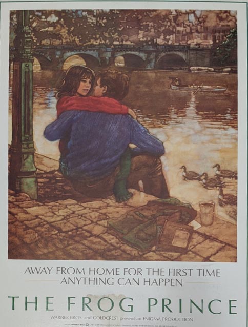
I think above poster was for German musical version of the Frog Prince starring Aileen Quinn and Helen Hunt - if so, it got a raw deal with both the reject and the final print (below).

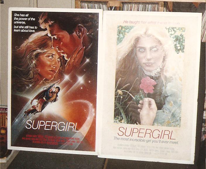
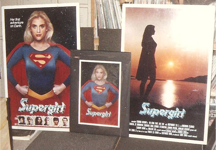
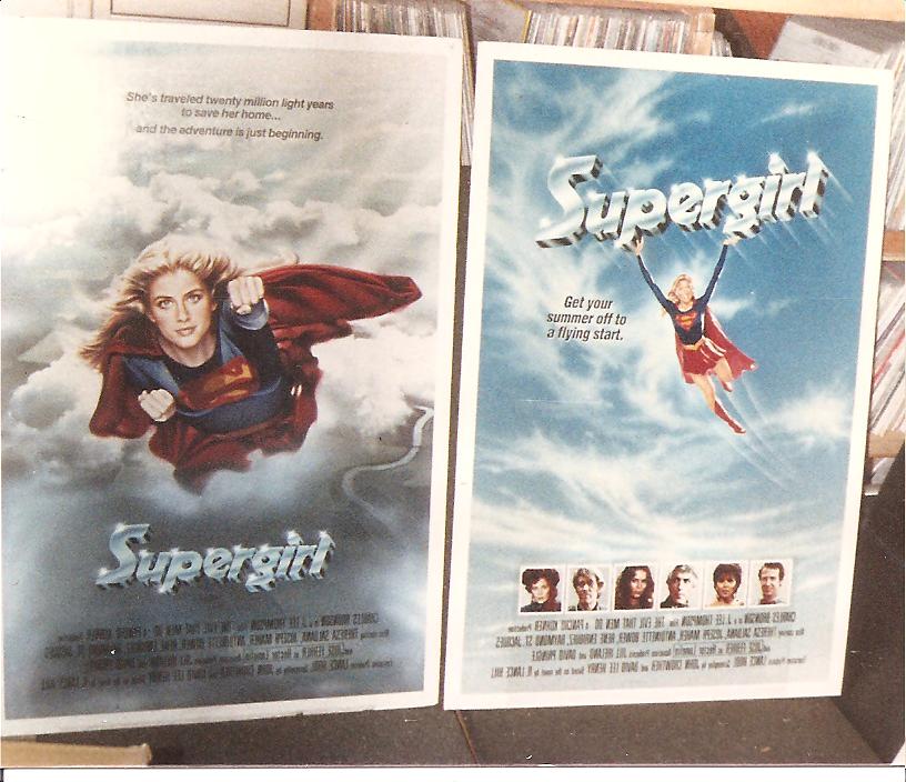
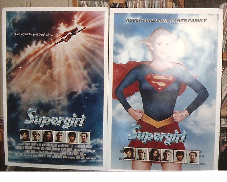
Here's a whole set of rejected poster art for the Supergirl movie.


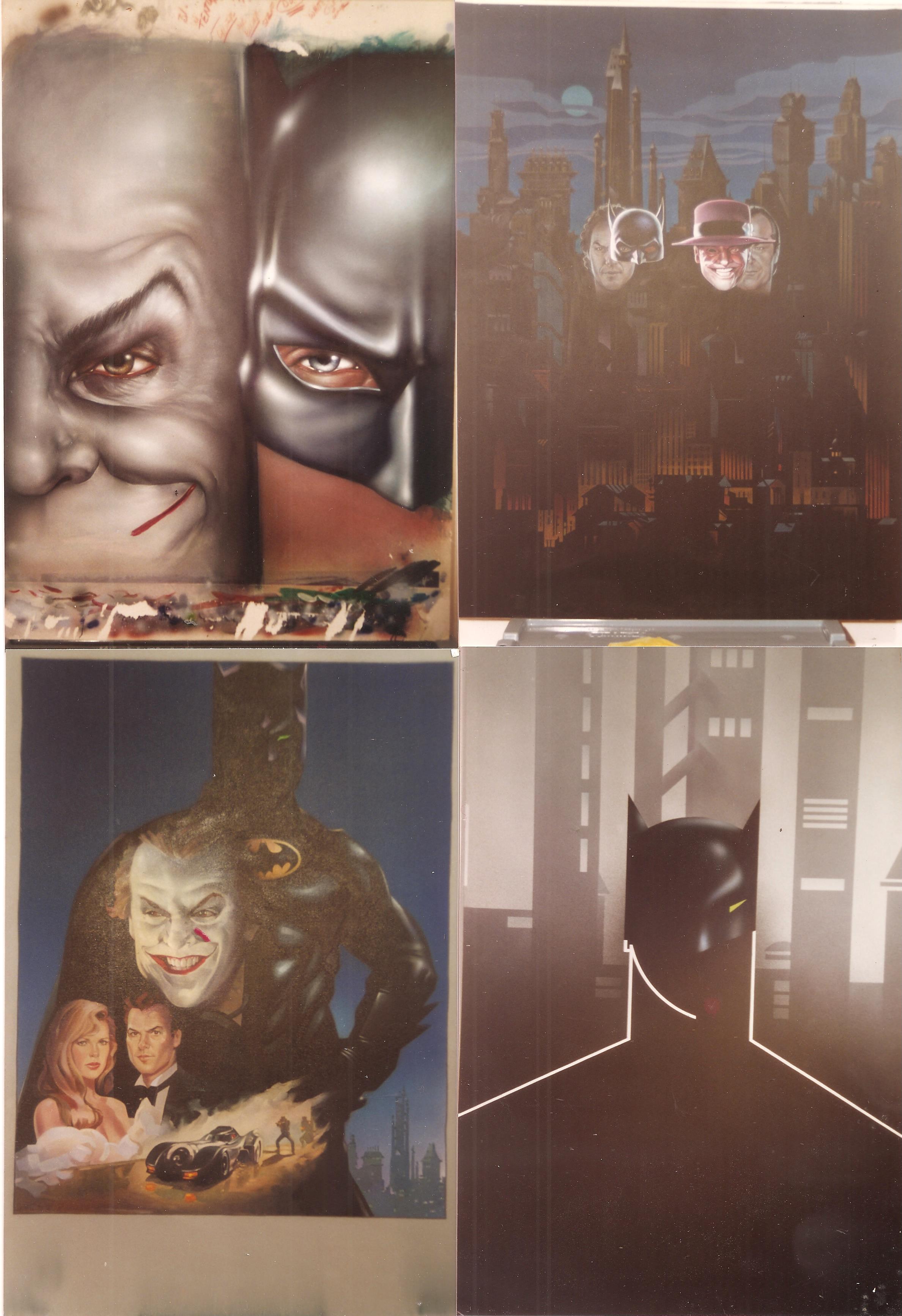
As long as we're on the original longlost DCU, below are several rejected Batman variants.
Original artwork below for something called Force III (below), at least that's how it was labeled on the back. Can't find much data about this or the artwork, it was apparently an A-Team clone television show that only aired a couple of episodes in 1986 before being cancelled.
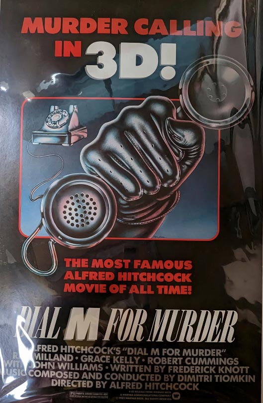
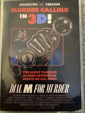
Above design for Dial M For Murder 3D ended up on a video/DVD box (below).
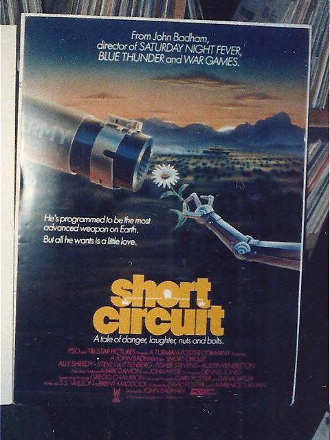
Above Short Circuit design went unused on U.S. posters, though I did find an import variant that picked up the artwork (below).

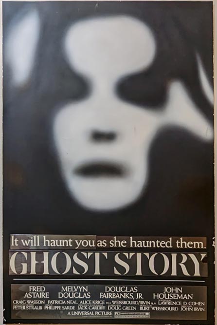
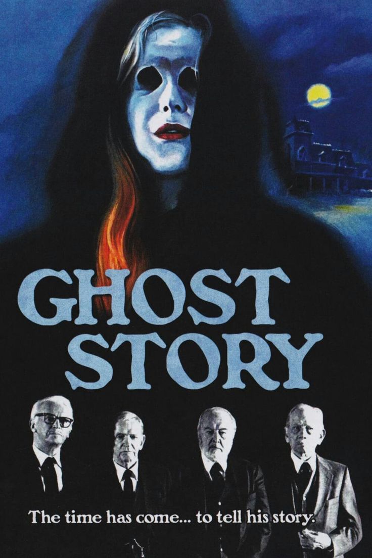
Above concept art for Ghost Story kind of maps out the basic look of the final poster (below).
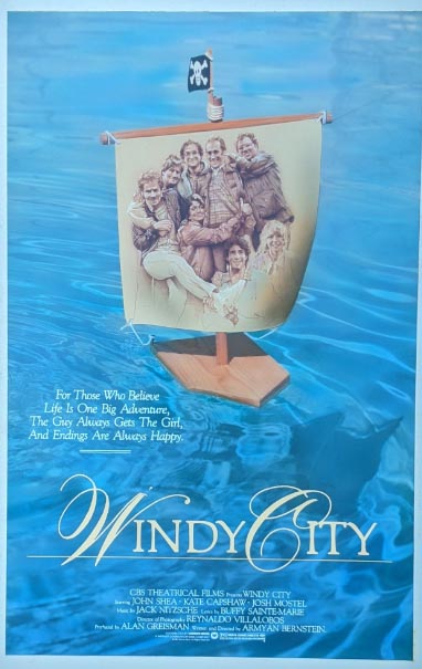
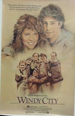
However, the Windy City reject (above) doesn't much resemble the actual poster (below), although the family photo makes a lot more sense in a collage than as a sail on a tiny toy boat. I can see why they airbrushed out the two main characters to instead place them at the top, but I wonder why they redrew the guy on the left kicking up his leg to instead be standing straight up?
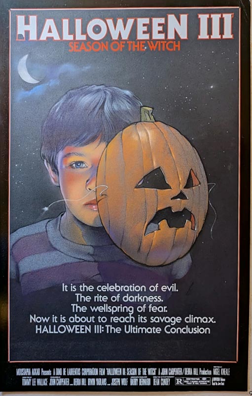
I rather like above concept art for Halloween III, much more than the final poster (below). The original plan for part 3 seems to have been a different movie than what they ended up making.

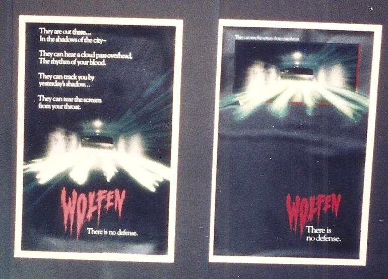
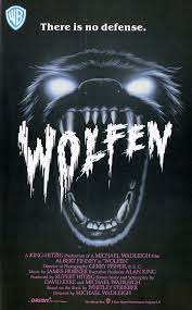
Above concept posters for Wolfen look pretty vague, as if they weren't really sure yet what the movie was about, though the title font and "There is no defense" tagline survived thru final poster they went with (below).
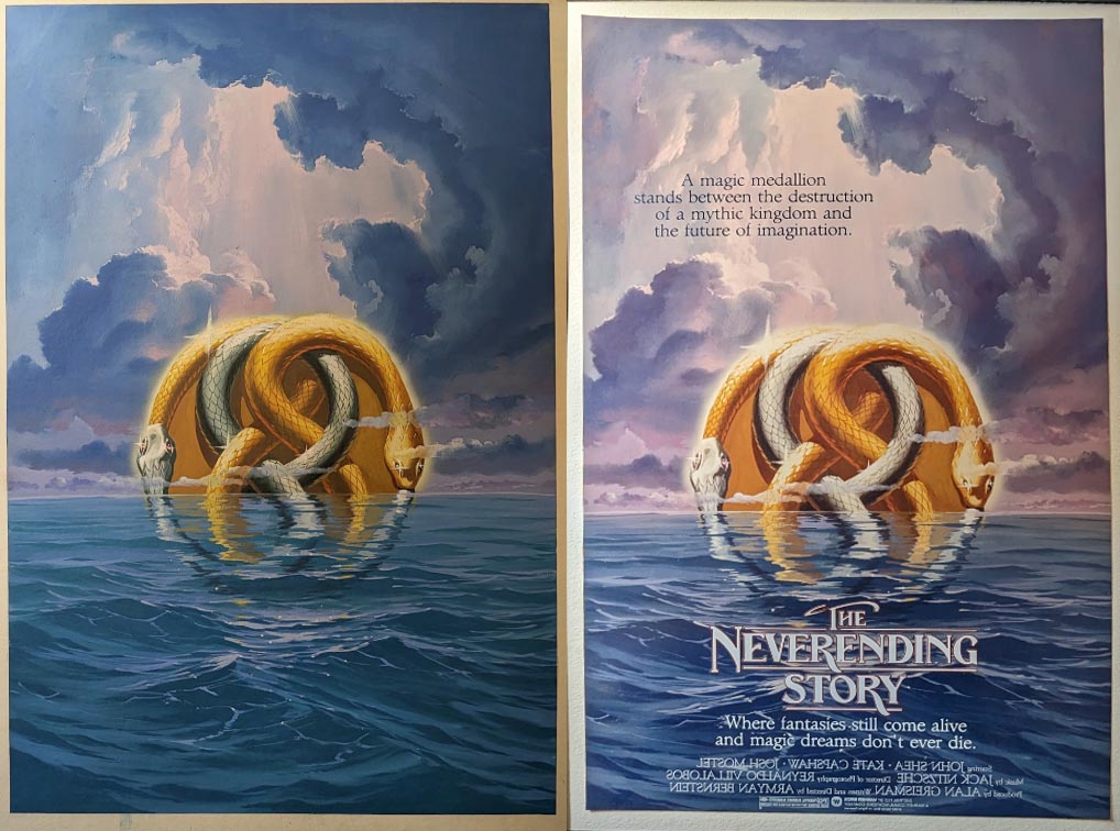
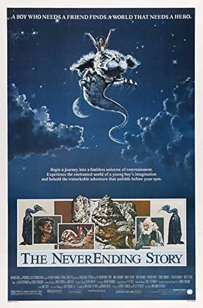
Pity the above Neverending Story design went unused, in favor of the familiar half-a-luckdragon image (below), though I can see why they wanted the actual characters to appear.
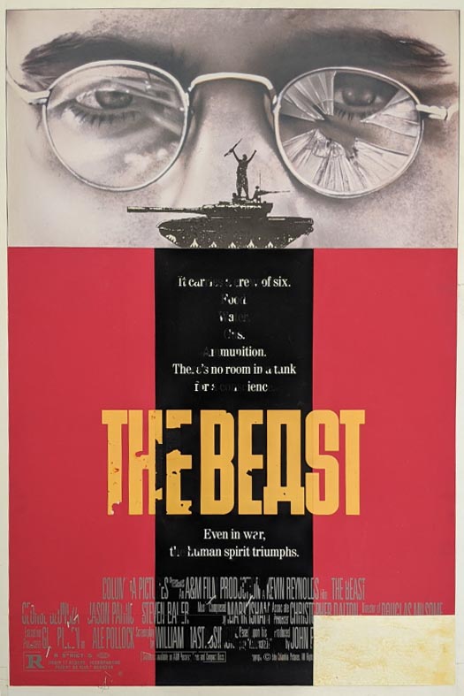
I can't find any Beast (of War) posters that match above concept design. Poster below seems to be the most common.

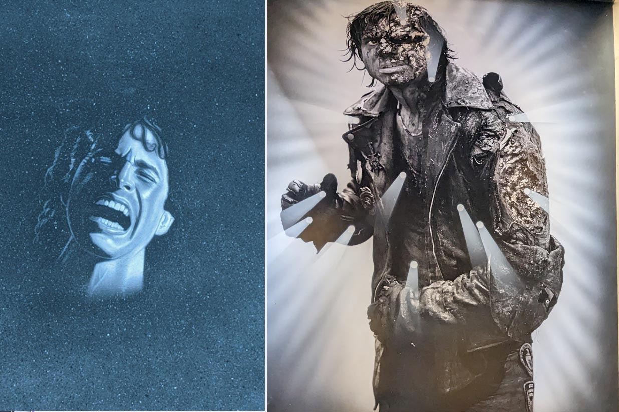
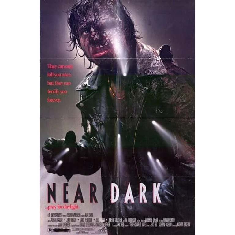
Here's some concept art for the vampire flick Near Dark (above) and the final poster (below).
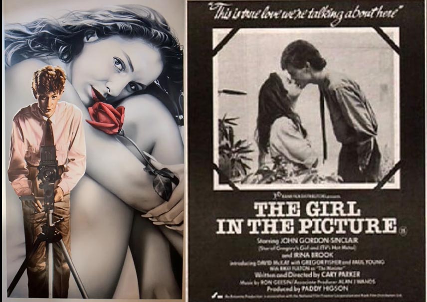
I can't find any examples of below concept art on the left for The Girl in the Picture being used in any form or media - the only poster I could find is on the right.
It was jaw-dropping to see how many variants were created for The Witches of Eastwick. One could spend hours noting all the little tweaks and variants from poster to poster.

Nicholson in a raincoat, or a suit? Ladies seen in the clouds, or just in the lightning?
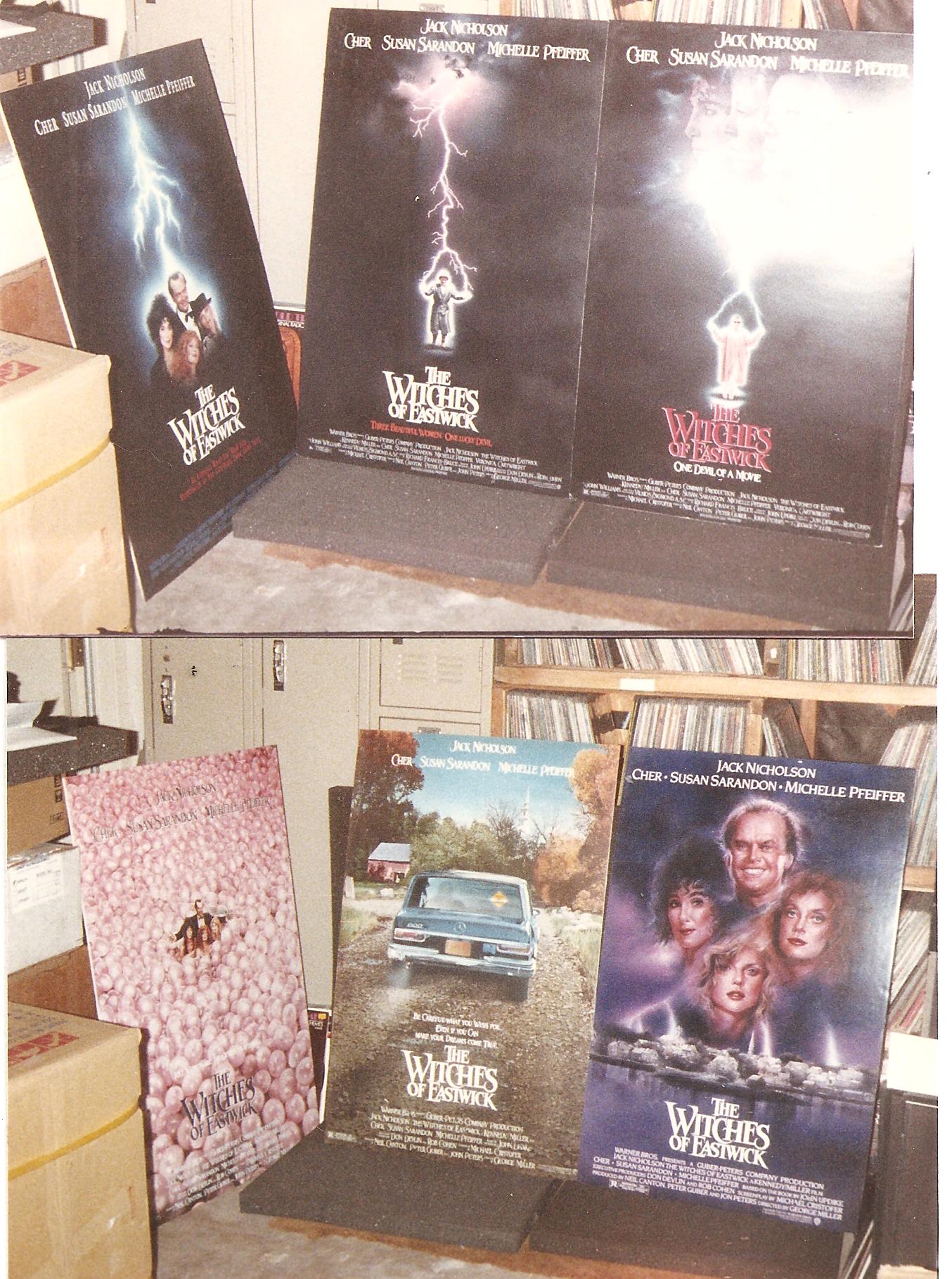
OR group the ladies with Jack near the bottom, or how about surrounded by, um, cherries? You remember the cherry scene, right?
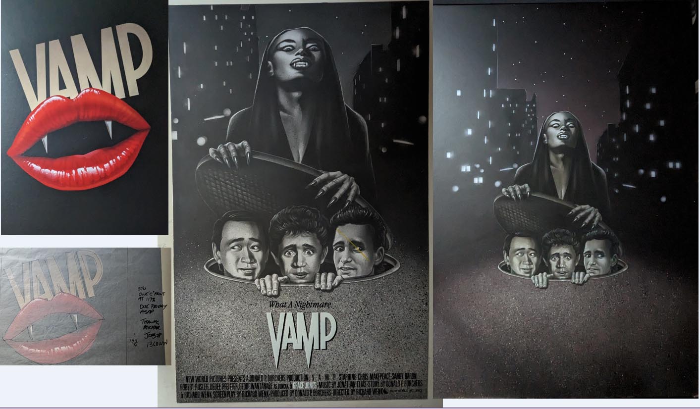
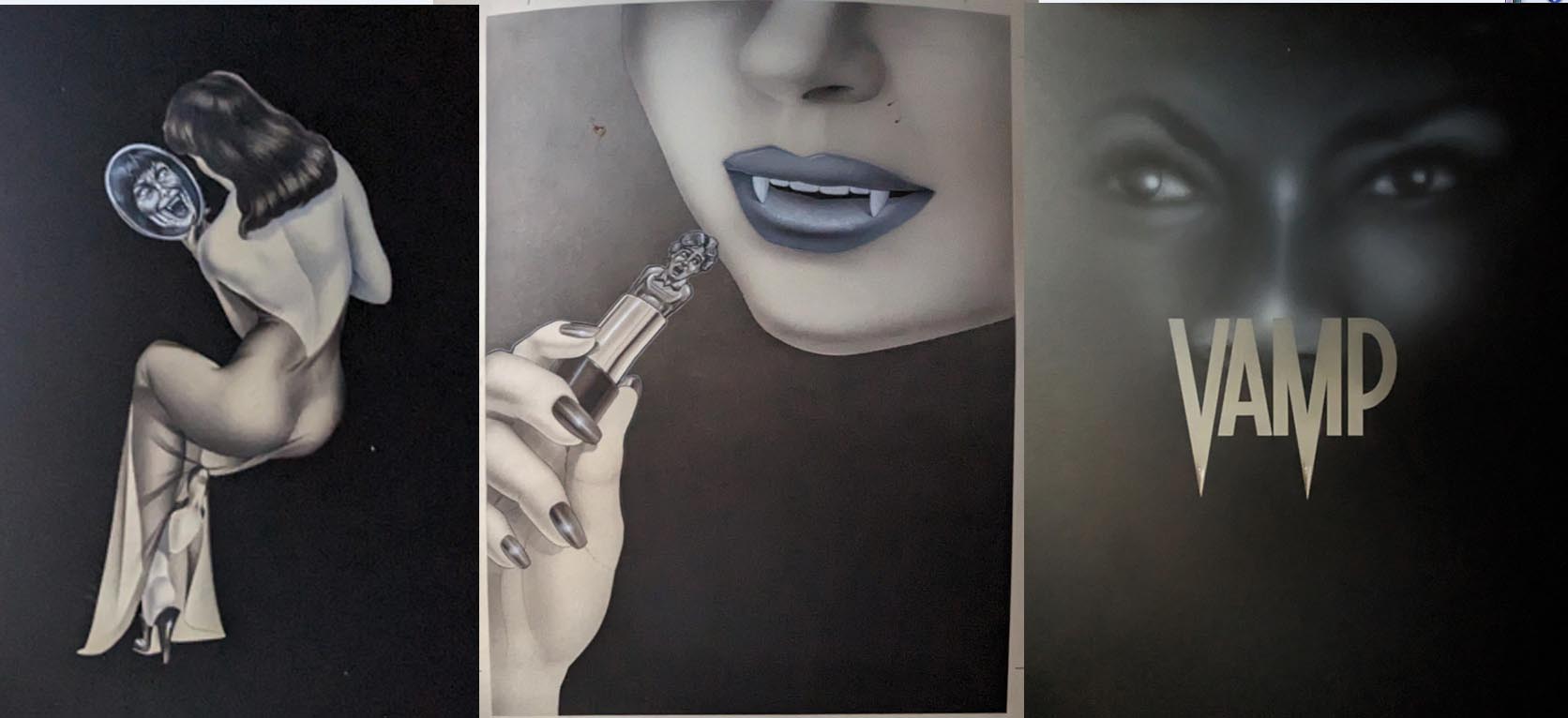
Original poster designs above and below for the Grace Jones flick Vamp. Uh, Grace, you've got a little something in your teeth there...
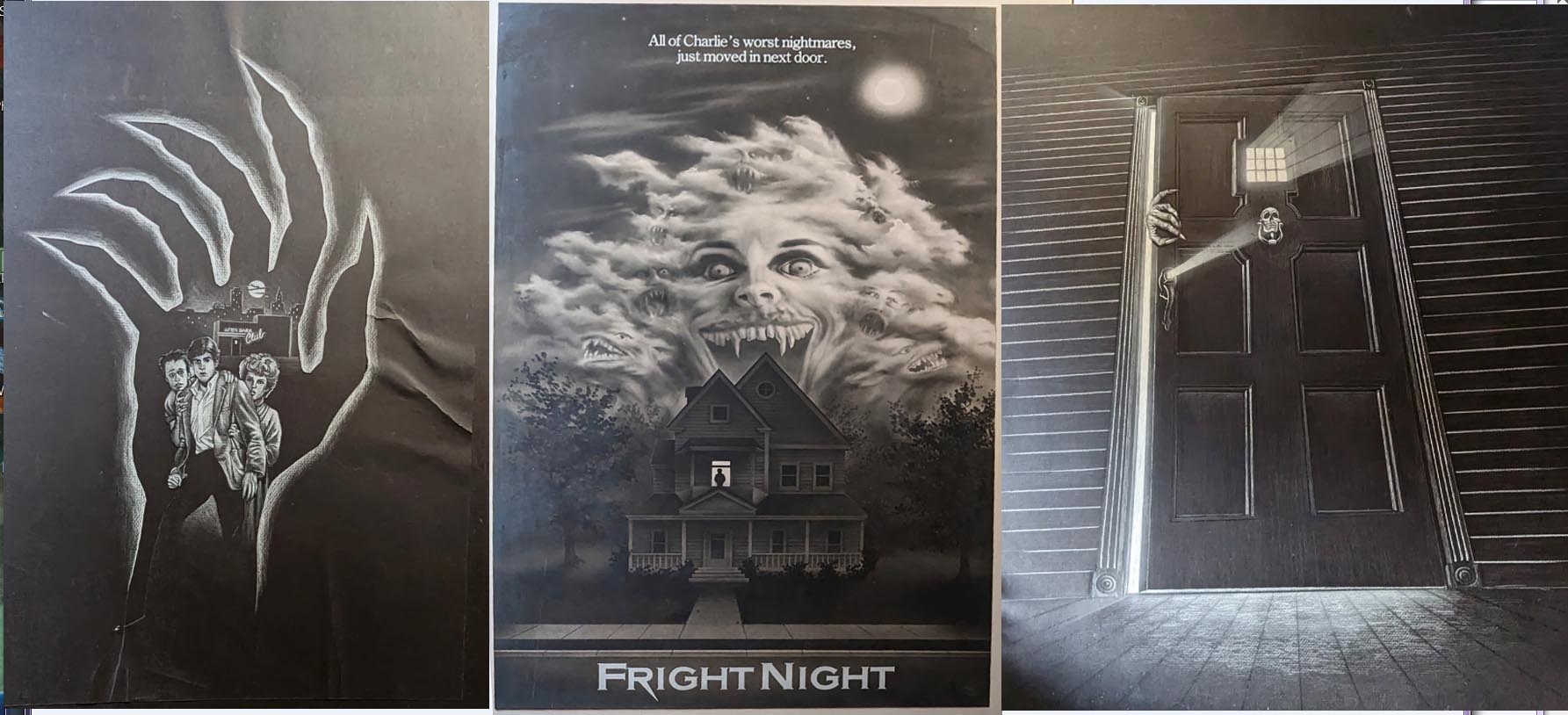
Though all three of the below Fright Night rejects are well-rendered, the painting on the far right is kinda generic and could be used for any number of movies.
Not all the posters had identifying marks or stickers, and many were a challenge to research. Below painting was among the easier mysteries to solve - it's a cowboy with angel wings, so I looked up Cowboy Angel and there was a Slim Pickens movie poster with the selfsame image.


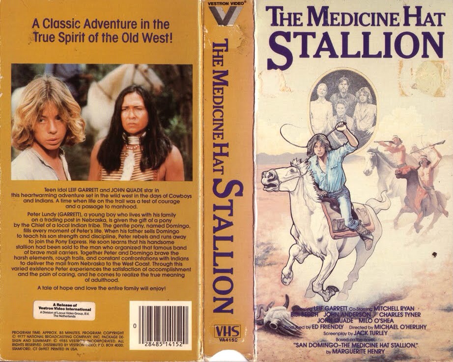
Above painting was unmarked, but someone finally recognized Leif Garret and we realized it was probably Peter Lundy & the Medicine Hat Stallion, in which he played a Pony Express rider. Sure enough, we found the artwork utilized on a videotape release (below).
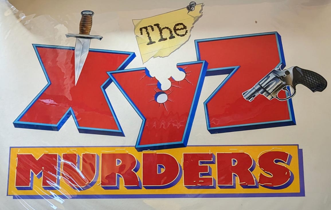
This one below for The XYZ Murders was probably an early title for a movie called Crime Wave, but that remains unclear.
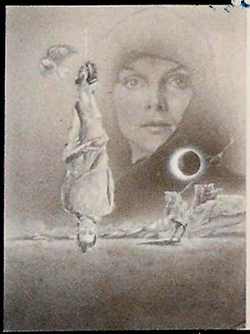
Here's a mystery poster below that had no markings when I photographed it. Other than knowing it's from the '80s, I'm stumped: any Reader readers able to help ID?
Another mystery poster that wasn't marked. Any help on this one????

How about this unmarked mystery poster?

Or this one?
Here's something you might be interested in.
Movie poster rejects you've never seen, longlost original artwork
Huge film history stash discovered and photographed
Movie poster rejects you've never seen, longlost original artwork
Huge film history stash discovered and photographed
Unused concept artwork for Voyage of the Rock Aliens
Here's a rare collection of scans from a collection of original artwork and proof prints that I once archived for local memorabilia dealer Duane Dimock. The collection includes over a hundred HUGE paintings and proofs, by a variety of well-known Hollywood poster artists, done in advance for the filmmakers behind Batman, the Fly, Witches of Eastwick, and a bunch of other biggies (as well as some not-so-biggies nonetheless of interest). Most of these are the REJECTED versions, although several sets include the actual final artwork, as photographed for the official posters.
In many cases, several similar designs are seen that show the ideas being worked out, in a creative progression leading up to the iconic images finally approved by the filmmakers and printed up to promote the film.
Few of these original paintings and poster proofs have ever been published or seen by the general public. You lucky Reader readers are the first to get an eyeful of this almost completely unchronicled bit of motion picture history -------
Browsing below, you can see the iconic poster artwork for The Fly originally had the image of a human climbing out of the device. However, what looked like a hastily spray-painted white paste-on was applied directly over the artwork, so only the white glow was evident in the final printed shot.
Ken Steacy's rejected poster for Supergirl coulda and SHOULDA found a way into theater marquees, as it's monumentally superior to virtually all the sappy over-airbrushed "official" posters that failed to lure any asses into the seats.
Most of the photos were shot with an old 110 Instamatic camera, over the course of the few hours I handled the originals: it just seemed like a good idea to archive what all was there. Most of this collection remains intact, though Dimock has sold off a handful of pieces.
The collection includes Destiny, Ladyhawke, 8 Million Ways to Die, Deadly Friend, Purple Hearts, City Limits, Hollywood Shuffle, the Inheritors, the Fly, Fright Night, Best Defense, Meatballs III, Vamp (quite a few variations), Inside Moves, XYZ Murders, Over the Top (yep, the Stallone movie, with a surprising amount of variations), Texas Godfather, Blood Diner, Howard the Duck, Cowboy Angel (a splendid oil painting of an angelic Slim Pickens riding a horse down from heaven?!), Trick or Treat (rock ‘n’ roll horror), Back to the Beach, Voyage of the Rock Aliens, Fatal Attraction, Little Shop of Horrors, Hanoi Hilton, Cop, Force III, Off Limits, Mac and Me, Mr. Love, Lady Beware, Phar Lap, Midnight Run, Bad Medicine, Hamburger Hill, Near Dark, Starchaser: The Legend of Orin, and others.
The original Howard the Duck comic books used to carry a cover tagline reading "Trapped in a world he never made." Whoever painted above rejected poster seems to have taken that quite literally, with Howard actually IN the world, coming out as if from an egg. Here's another ditched duck concept:
I cracked up when I noticed the Over the Top reject above where Stallone seems to have his side view mirror adjusted so he can stare at himself instead of the road - note that's the only variant with his NAME running all the way over the TOP of the poster, independent of the film title. Here's few more rejected OTP posters.
I LOVE above unused Ladyhawk painting!
The iconic poster artwork below for The Fly originally had more of the image of a human climbing out of the device, including the outline of his head and shoulders. Here's the version nobody has ever seen before!
However, as you can see in above variant version, what looked like a hastily spray-painted white paste-on was applied directly over the artwork, so only the white glow was evident in the final printed shot, with just the human arm and insect leg coming out either side. BIG improvement, with a much more mysterious impact.
Me, I kinda like the above rejected version showing just a fly: THE Fly, with Jeff Goldblum's head! Although, now that I examine more closely, that looks like Donald Trump! "Screeeen meeeeeee!"
While researching this artwork, I discovered that a lot of pieces that at first seemed to be "rejected," IE not the final poster we're used to seeing in the U.S., did finally end up being recycled into service for later media (video, DVD) and for overseas releases. Above artwork ended up being used for an import poster for Friday the 13th Part 5 (below).
I kind of like the wistful nostalgia in this proposed painting for Phar Lap (above), but they went in a different direction with the final poster (below).
Marked on the back as "Running Scared," above mockups of course ended up being for Midnight Run. Final print below shows they went with DeNiro glaring more directly at Grodin, whose handcuffed wrist was switched to the other side (a subtle, but strong, improvement).
A variation of above two mockups for Starchaser: The Legend of Orin finally ended up on the DVD packaging (below), though the theatrical poster was pretty different.
Above Bad Medicine designs appear to have been abandoned altogether for the final published poster (below).
The original photo print for Hamburger Hill (above) had the soldiers more more clearly lit and visible - going with the darkened outline in the final released version (below) seems a good, and somewhat somber, way to go!
Unused painting for A Time of Destiny with William Hurt (above).
Interesting to see that the original rejected Campus Man poster art (above) spotlighted the comic lead (John Dye), while the final released print (below) went with the hunky alter-ego image.
Nightmare on Elm Street honcho Wes Craven went through several poster ideas to promote Deadly Friend (above)...
...finally setting on above painting, with the center painting of the girl added to the window painting for the final printed poster seen below.
The eyeball variation also turned up later on a DVD package (below), but with the artwork heavily airbrushed, to hide the fact that the added nose and fingernails are clearly by a different (and much crappier) "artist."
From a design standpoint, I prefer the completely unused Deadly Friend skull variant below, with its eyes subtly depicting the romantic couple facing each other!
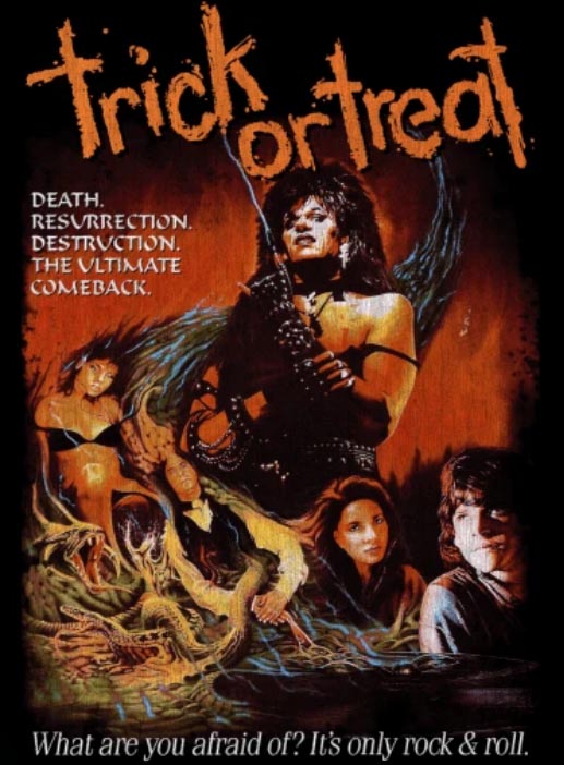
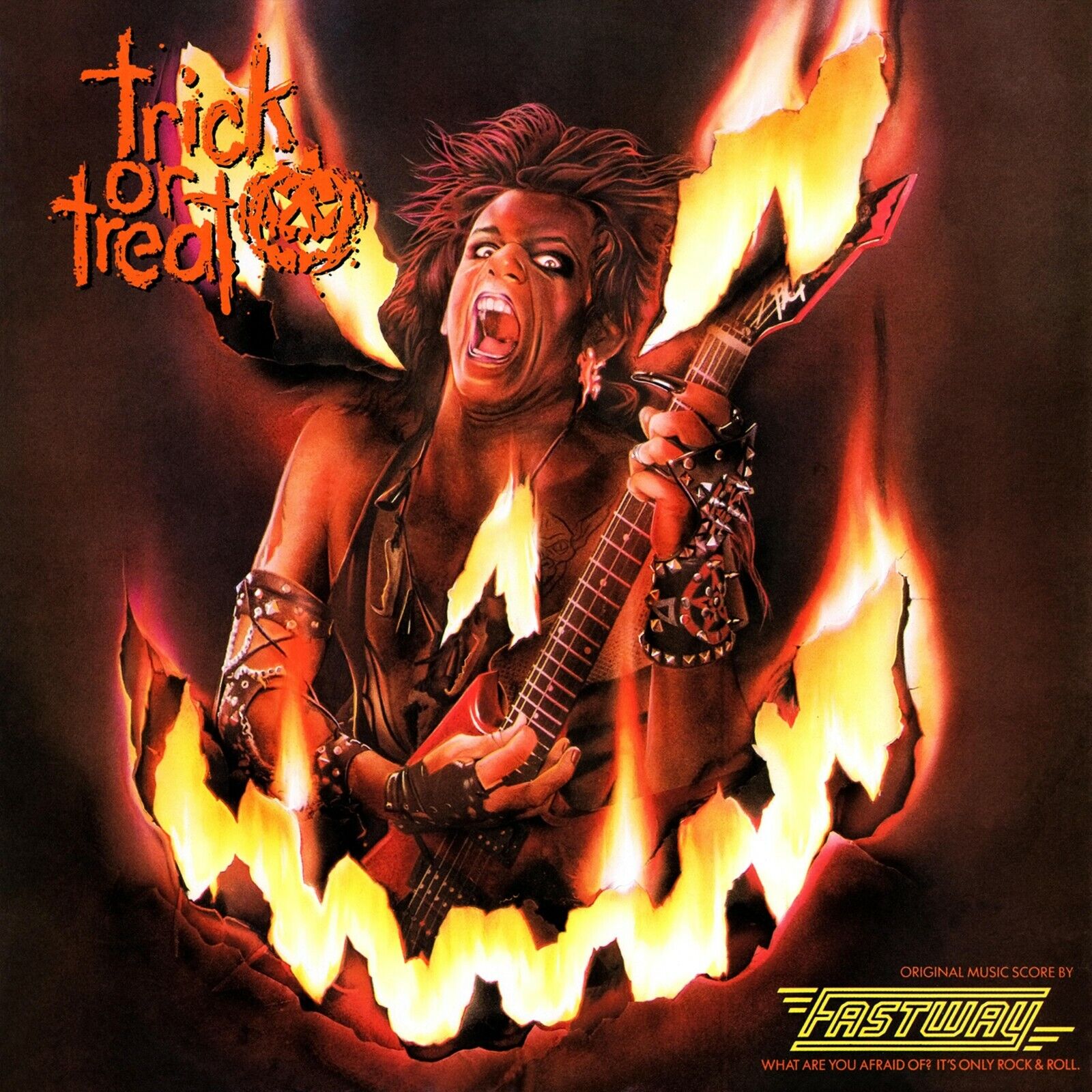
As terrible as the rockin' horror movie Trick or Treat is, the poster COULD have been okay, had they gone with rejected oil painting (above) instead of the crappy final poster (below).
An altered version of the rejected painting did eventually turn up as a CD cover (below) from soundtrack band Fastway.
Blood Diner art above, final released poster below.
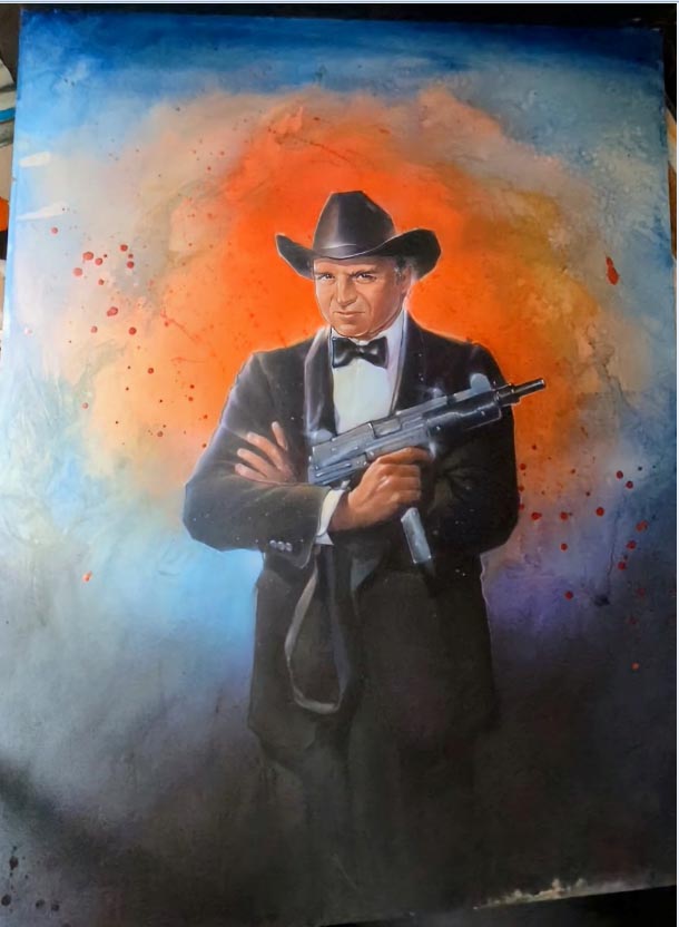
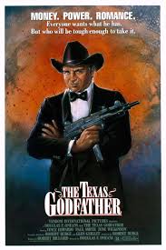
The Texas Godfather art above, final poster below.
Above proof for the Elliott Gould/Margot Kidder potboiler Vanishing Act is pretty close to what was used (below).
Whereas the ominous China Girl artwork (above) was completely ditched for the (quite lame) poster below.
8 Million Ways to Die, before (above) and after (below).
The City Limits rejected original art (above) seems to my eye far superior to the final versions used for a European DVD and the U.S. movie poster (below).
And interesting how they ditched the soldier's photo-decorated military helmet (above) altogether for Purple Hearts, to instead blow up the romantic photo, hovering over a battlefield (below). Another major misfire, IMHO.
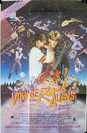
The Pia Zadora cult classic Voyage of the Rock Aliens was a cynical attempt to create a "cult" film (co-starring Harold & Maude icon Ruth Gordon), but the above rejected poster couldn't make up its mind WHAT to showcase.
I can't say final posters (below) are any improvement. The trippy guitar-shaped spaceship all but obscured in the reject gets a sweet makeover (with tuning pegs instead of satellite dishes on the headstock), and there's still a (space?)hydrant leaking onto a (space?)dog, but most of the other proposed elements were ditched.
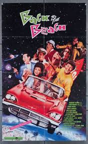
The concept art for the (pretty cool) Annette Funicello/Frankie Avalon/Pee Wee Herman vehicle Back to the Beach (above) is SO bizarre, words fail me. In this case, the final poster (below) is a VAST improvement! The only holdover from the nearly deranged mockup was a simplified version of the title logo.
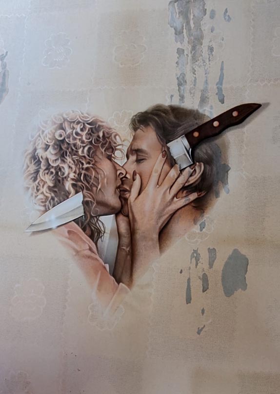
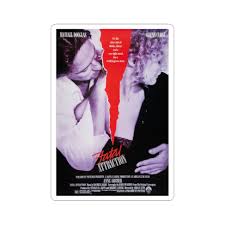
I'm really impressed by the design qualities of above concept art for the Michael Douglas/Glenn Close thriller Fatal Attraction, even though it looks like Douglas' stunt double posed for the pic rather than him. The now-iconic final poster (below) works well now that we all know the storyline, but I can't help but feel the reject would have been a much stronger pre-release promo. Ahh, whaddo-eye-no, the ghastly thing was a monster hit anyway (in support of my many rabbit friends, I'm still boycotting that one - my duck friends won't let me watch Journey to the Center of the Earth either).
The James Woods Cop mockup (above) was pretty similar to what ended up being used (below).
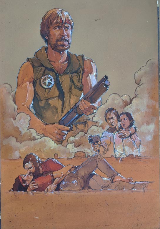
Here's the original artwork for the Chuck Norris film Lone Wolf McQuade (above) along with the mostly unchanged final poster (below).
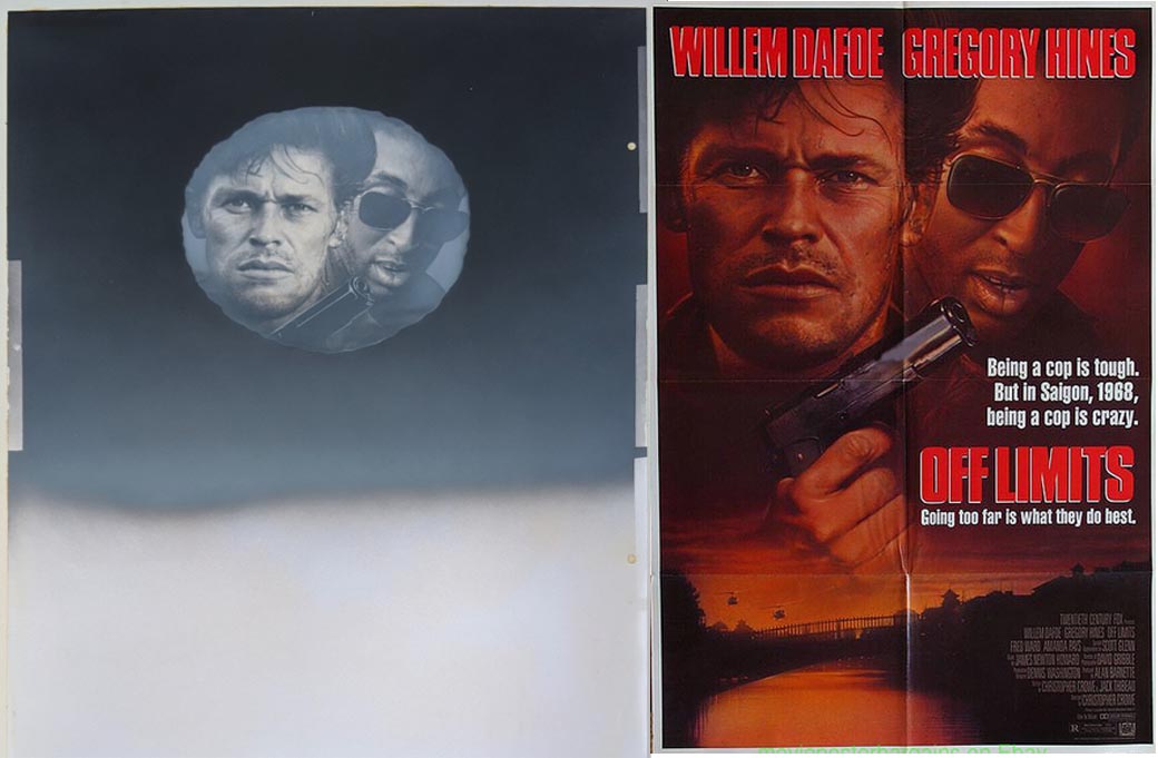
Rejected Off Limits concept art below on left and final poster on right.
Welcome to Valkenvania (above left) was later retitled Nothing But Trouble, with a few shifts done to a couple of characters in the final artwork as well.
Deadly Blessing reject (above) VS final poster below. Only major changes are the rejected tagline "Beauty Comes to an Evil Climax" (coupled with the pic, maybe it looked like the movie was about an evil beauty, um, climaxing?) and some kind of satanic-looking logo that got cut. Also, note how the overlay text is lowered several inches on the final poster, the better to reveal MUCH more glowing blue cleavage...
Despite Jack Nicholson only making a brief appearance in the original Roger Corman horror comedy Little Shop of Horrors, it was Jack they focused on for the re-release poster (above). The design appears to have turned up in poster variants, including a Spanish version (below).
It took me awhile to find a utilized version of the poster artwork for the obscure sex comedy Perfect Timing that used above artwork, but here 'tis below.
Above poster design for Hanoi Hilton is pretty much what was used, though note final version (below) was revised to feature an additional fence railing, some chain link fencing on either side of the doorway, and an extra Vietnamese soldier was added, I guess to reinforce the "captivity" theme.
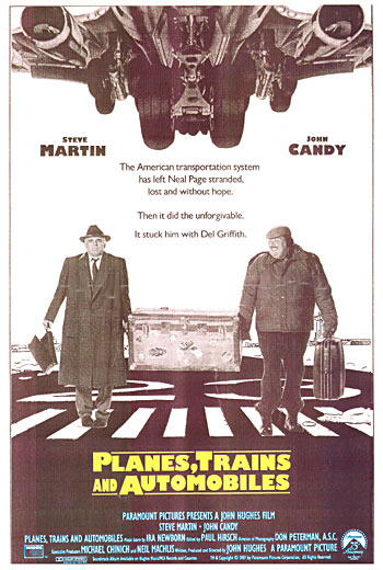
Above concept proof for Steve Martin and John Candy in Planes Trains & Automobiles seemed to favor the titular plane, a motif that turned up in altered form on the French movie poster (along with a train and an auto, tho they were flying too). The whole vehicle schtick was jettisoned entirely for the U.S. version now so recognizable, as well as foreign posters (below), wherein Candy wore basically the same dumpy outfit seen on the proof, while Martin went from trenchcoat to rumpled suit (duh!), and they BOTH lost the stupid hats (who the Hell puts a hat on Martin's million dollar mane?!).
Rocky: The Final Bell (above) was the original title for Rocky V, for which the final utilized poster (below) wisely didn't rely on a near-comatose closeup of Stallone.
Full-length McDonald's commercial Mac & Me actually had an intriguing poster (below) that seemed to deliberately rip off ET, but the rejected mockup (above) is a bit of a head scratcher. At least the wheelchair in the rejected version (above) was a somewhat more honest representation of the actual flick.
Above shows the entire photo of Diane Lane from Lady Beware, used for final print below.
I'm so glad to see the terrific painting above did indeed make it onto the poster for the UK comedy Mr. Love, flanked below by two rejected drafts.
Hollywood Shuffle collage mockup above and final poster below.
Above: Original painted artwork for the Walter Bannert’s German-language Austrian film the Inheritors alongside final print.
Check out the original painted art for the Return of the Living Dead tombstone (above), before the comical zombies were added to the final poster. Note the spraycan-bearing skeleton hand was originally the only part of the zombie arising from the grave.
And this was a real surprise. Note above horizontal variant is dated a full two years before Return of the Living Dead was actually released. And it was originally planned for 3D?! As far as I know, this is a hitherto unknown component in the film's early development ---
I LOVE the unused painting for the camp(y) comedy Meatballs III (above) with a dude in a bear suit chasing bikini-clad Shannon Tweed (Mrs. Gene Simmons must've always had a thing for guys in costumes). Apparently, the subtitle "Rudy's Big Challenge" hadn't been christened yet, as Rudy is nowhere to be seen. I also totally dig the iconic final version (below) of this guilty pleasure co-starring Sally Kellerman (and featuring Loverboy's "The Kid is Hot Tonight"! Premium cheez or what?!). What's weird, though, is that the above reject DID eventually turn up, but on a poster for an entirely separate movie called State Park.
Best Defense rejected draft (above) and the final released poster (below). Now this one is flippin' bizarre - look how the tank blueprint originally had Eddie Murphy drawn in, as if part of the rendering, looking dumbfounded by the broken steering wheel. But the crazy effin final print (below) pasted in a B&W photo of Murphy's face, inexplicably grinning like a happy idiot, despite his clearly defective ride! And the rejected tagline seems much better too. They went with "Unfortunately, they're both on our side," but I prefer "Laughter is still your best defense." Too bad nobody who saw this movie was laughing.
Inside Moves reject (above), which is a fabulous painting evocative of Norman Rockwell, versus the dull and drab final version (below).
Rosary Murders photo pasteup above, while the whole corpse-in-a-tub motif was still in the planning stage. Poor ol' Charles Durning - in the reject, he looks like he might have a good clue whodunnit. But in the final published poster (below), he looks like some confused doofus with a runny nose. And whoever elongated the horizontal murder victim's arm forgot to include an elbow!
I think above poster was for German musical version of the Frog Prince starring Aileen Quinn and Helen Hunt - if so, it got a raw deal with both the reject and the final print (below).
Here's a whole set of rejected poster art for the Supergirl movie.
As long as we're on the original longlost DCU, below are several rejected Batman variants.
Original artwork below for something called Force III (below), at least that's how it was labeled on the back. Can't find much data about this or the artwork, it was apparently an A-Team clone television show that only aired a couple of episodes in 1986 before being cancelled.
Above design for Dial M For Murder 3D ended up on a video/DVD box (below).
Above Short Circuit design went unused on U.S. posters, though I did find an import variant that picked up the artwork (below).
Above concept art for Ghost Story kind of maps out the basic look of the final poster (below).
However, the Windy City reject (above) doesn't much resemble the actual poster (below), although the family photo makes a lot more sense in a collage than as a sail on a tiny toy boat. I can see why they airbrushed out the two main characters to instead place them at the top, but I wonder why they redrew the guy on the left kicking up his leg to instead be standing straight up?
I rather like above concept art for Halloween III, much more than the final poster (below). The original plan for part 3 seems to have been a different movie than what they ended up making.
Above concept posters for Wolfen look pretty vague, as if they weren't really sure yet what the movie was about, though the title font and "There is no defense" tagline survived thru final poster they went with (below).
Pity the above Neverending Story design went unused, in favor of the familiar half-a-luckdragon image (below), though I can see why they wanted the actual characters to appear.
I can't find any Beast (of War) posters that match above concept design. Poster below seems to be the most common.
Here's some concept art for the vampire flick Near Dark (above) and the final poster (below).
I can't find any examples of below concept art on the left for The Girl in the Picture being used in any form or media - the only poster I could find is on the right.
It was jaw-dropping to see how many variants were created for The Witches of Eastwick. One could spend hours noting all the little tweaks and variants from poster to poster.
Nicholson in a raincoat, or a suit? Ladies seen in the clouds, or just in the lightning?
OR group the ladies with Jack near the bottom, or how about surrounded by, um, cherries? You remember the cherry scene, right?
Original poster designs above and below for the Grace Jones flick Vamp. Uh, Grace, you've got a little something in your teeth there...
Though all three of the below Fright Night rejects are well-rendered, the painting on the far right is kinda generic and could be used for any number of movies.
Not all the posters had identifying marks or stickers, and many were a challenge to research. Below painting was among the easier mysteries to solve - it's a cowboy with angel wings, so I looked up Cowboy Angel and there was a Slim Pickens movie poster with the selfsame image.
Above painting was unmarked, but someone finally recognized Leif Garret and we realized it was probably Peter Lundy & the Medicine Hat Stallion, in which he played a Pony Express rider. Sure enough, we found the artwork utilized on a videotape release (below).
This one below for The XYZ Murders was probably an early title for a movie called Crime Wave, but that remains unclear.
Here's a mystery poster below that had no markings when I photographed it. Other than knowing it's from the '80s, I'm stumped: any Reader readers able to help ID?
Another mystery poster that wasn't marked. Any help on this one????
How about this unmarked mystery poster?
Or this one?